A Study: Album Cover Typography & Artwork: 1970s
A look at various graphic design elements from my collection of original LPs (including some very obscure rarities) dating from 1970-1979.
For this collection of album cover art and typography, I pick up right where we left off...1970.
Now, unlike my 60s collection, I don't have as many obscure artists/albums here...in fact, many are quite well-known (though possibly, not so at the time of these releases). However, there are still a good half-dozen or so that I imagine most people have never seen, nor heard of.
Ultimately, this decade (in terms of album design) really gave us everything...and it shows. While you can definitely feel the lingering effects of a post-60s-hippie-psychedelic world, there was clearly a more targeted focus, investing an even greater amount of time in molding the creative identity of the artists into the album designs themselves.
I hope you enjoy this collection.
note: This project is being presented as a typographical/artistic reference: a study in truly original and influential album cover artwork and typography of a magnificently creative & innovative time. It's also a glimpse into my own personal music library and a greater insight into my varied musical influences. Best if viewed in full-size.

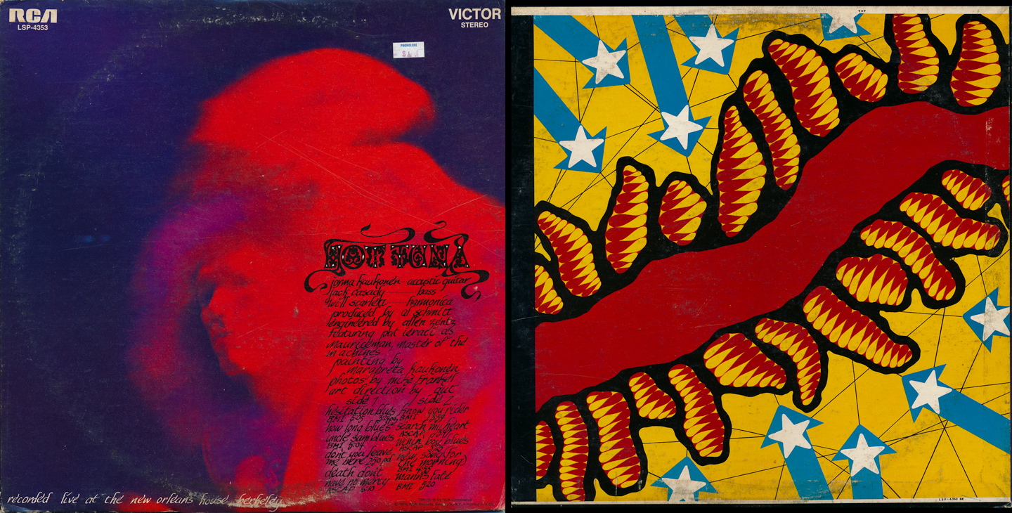
Hot Tuna: self-titled debut (1970)
Initially formed as a way to 'get back to their roots' by playing a mixture of traditional acoustic blues as well as electrified Chicago blues, Hot Tuna was the brainchild of Jefferson Airplane members Jorma Kaukonen and Jack Cassady. This debut (which was recorded live) was a good start for the band who continues performing today. As for the typography...it wasn't until I scanned the album cover (after owning the LP for over 20 years) that I could finally 'read' what was on it! There's definitely a lesson to be learned there...keep it legible! And what's with the back cover image? I have no idea. Maybe you can fill me in.
Choice tracks: Hesitation Blues, Death Don't Have No Mercy, I Know You Rider

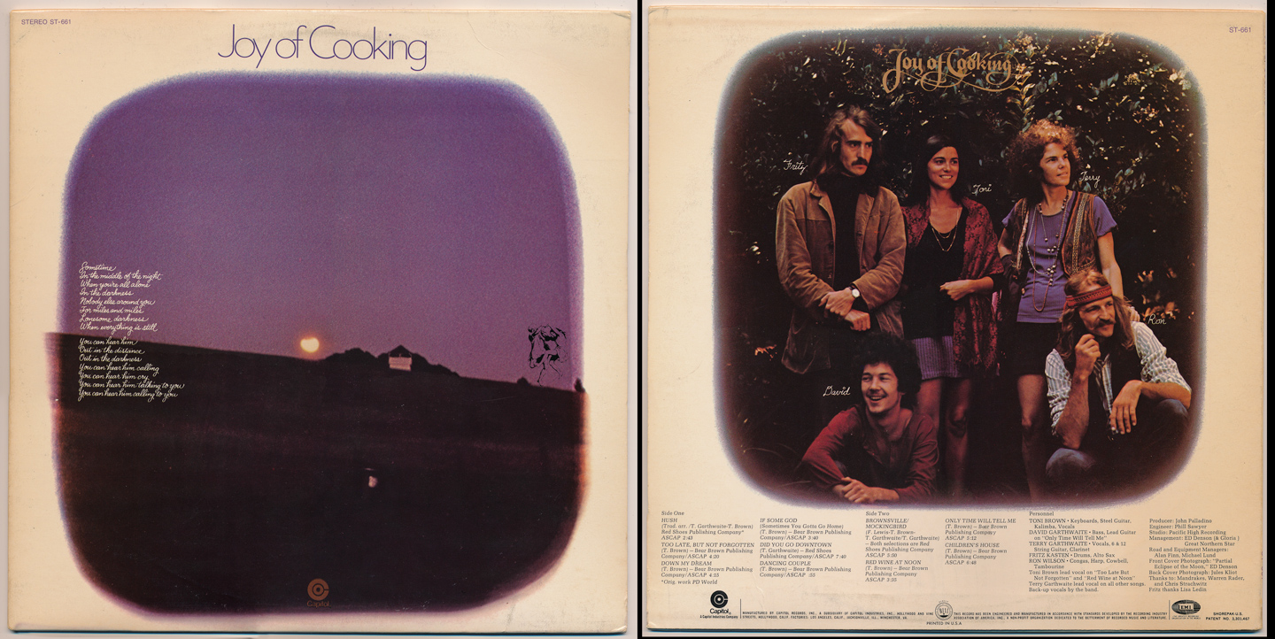
Joy of Cooking: self-titled debut (1970)
One of the more obscure albums in this collection, Joy of Cooking were a folk-rock band led by female members Terry Garthwaite and Toni Brown. While they never achieved huge success, they definitely made an impression on the scene and female-led bands that would follow.
I've always loved the type on the front and back covers, and this again has found its way to some of my own designs/covers for various projects over the years.
Choice tracks: Too Late But Nor Forgotten, Down My Dream, Brownsville/Mockingbird

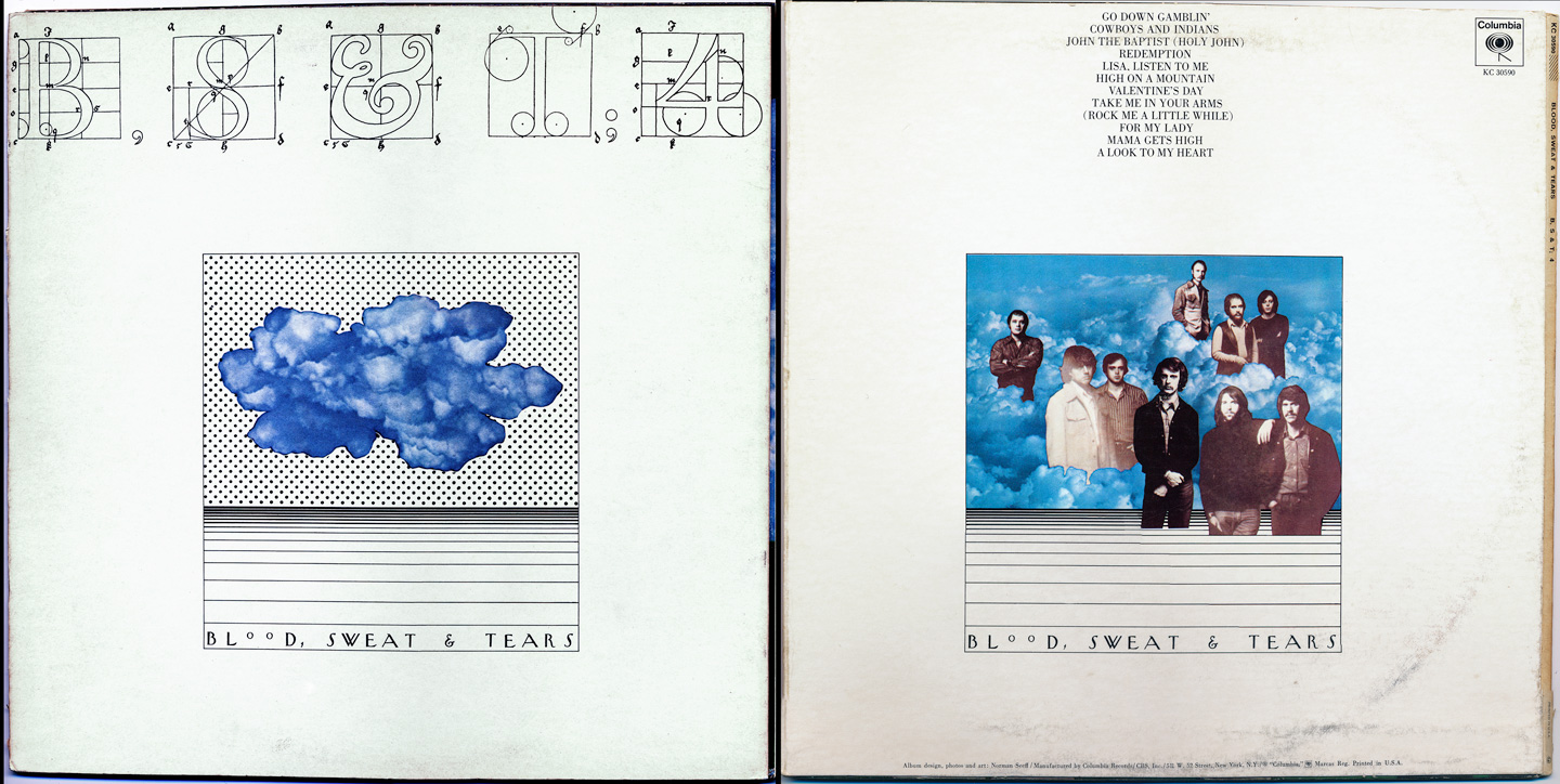
Blood, Sweat & Tears: BS&T 4 (1971)
BST were huge hit-makers in the late 60s/early 70s. By the time of this, their fourth album, they were on the verge of a complete band shift (in personnel and sound)...but this last gem still has some great musical moments. I remember seeing this one for the first time (purchased back in my college days) and was just in love with the slightly-bizarre, hand-lettered text on the cover. It still intrigues me today.
Choice tracks: Go Down Gamblin', Lisa Listen To Me, Take Me In Your Arms

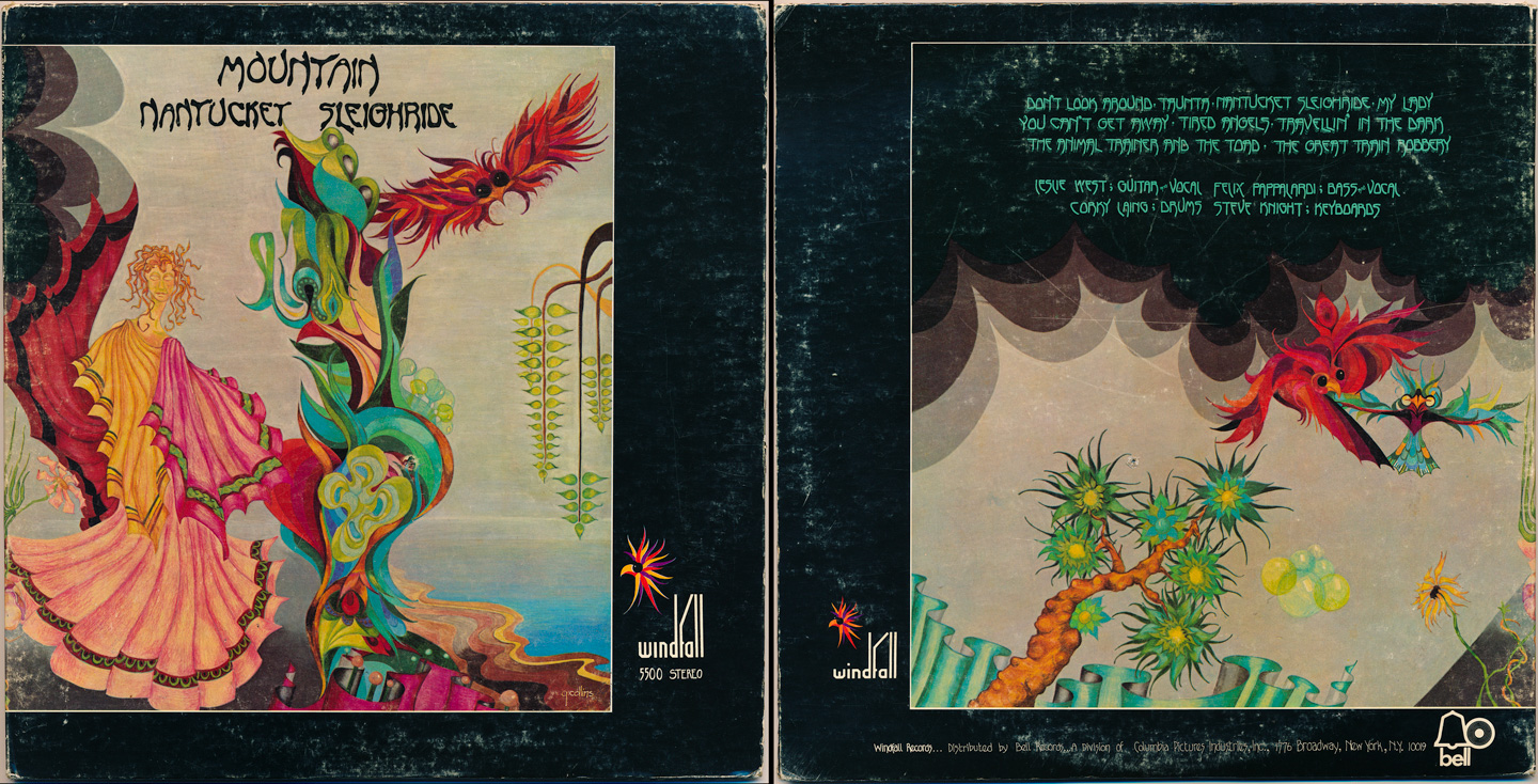
Mountain: Nantucket Sleighride (1971)
Continuing the trend of hand-lettered logos, Mountain's '71 release would contain their last original 'hits' (not unlike BS&T above). The cover artwork in conjunction with the dark and groovy text on the front and back really just leapt out at you from the record bin...much like the music within the grooves.
I was never a huge fan (their previous LP was a better showcase, IMO) but the album cover alone prompted this purchase (that, and my need to be a completist when it comes to collecting artists' works). It's a good record with some very cool artwork and a broad artistic statement from this original powerhouse quartet.
Choice tracks: Nantucket Sleighride, You Can't Get Away, My Lady

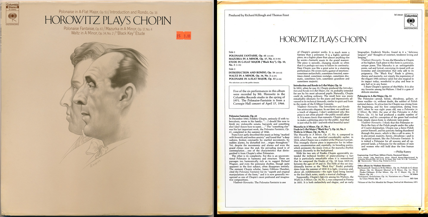
Vladimir Horowitz: Horowitz Plays Chopin (1971)
I'm including this particular album to highlight the fact that even the classical markets were intimately aware of the need for slick, clean, well-designed covers, particularly at this time in music (when classical and jazz were far from outselling their rock competitors).
If you're a Chopin fan, this album is a must, and the cover still brings back memories when I first purchased it in 1993. It just works all around...and it would go on to be one of Horowitz' best sellers.
Choice tracks: Polonaise Fantaisie Op.61, Etude in G-flat Major ("black key"), Introduction and Rondo Op.16

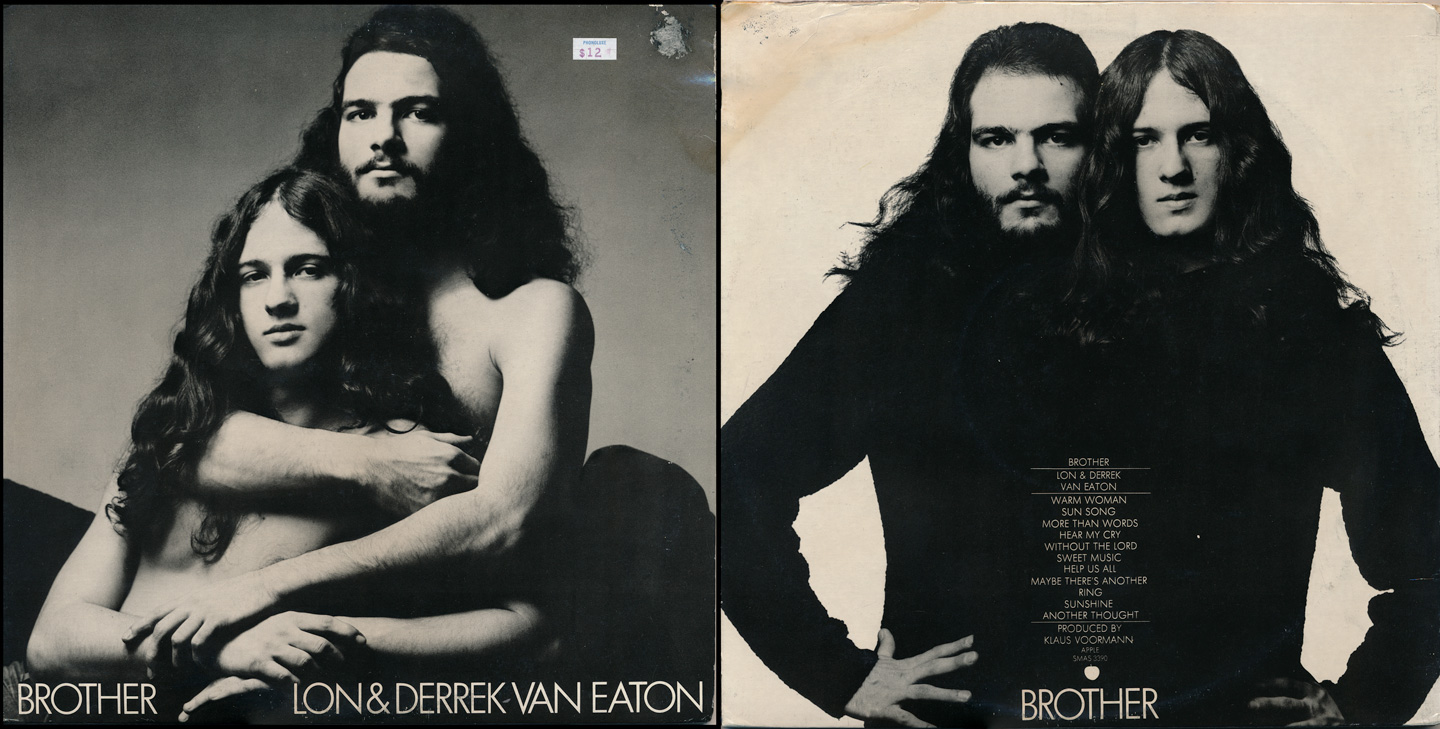
Lon & Derrek Van Eaton: Brother (1972)
And back we go to the obscure, esoteric pieces in my musical library. The short story: Apple Records (the Beatles' label, and the 'original' Apple) was soliciting for new talent. Lon and Derrek submitted a tape recorded on a Revox open-reel; it was heard by George Harrison and John Lennon, and the rest is history.
They had a semi-hit single entitled 'Sweet Music' produced by George Harrison, and this album has since become a rarity (though it was re-released through some other indie label last year). This particular type style was very common on the Apple Records releases in the early 70s...and the front/back cover images? Classic. Weird. Groovy. Apple Records.
Choice tracks: Sun Song, Sweet Music, Sunshine

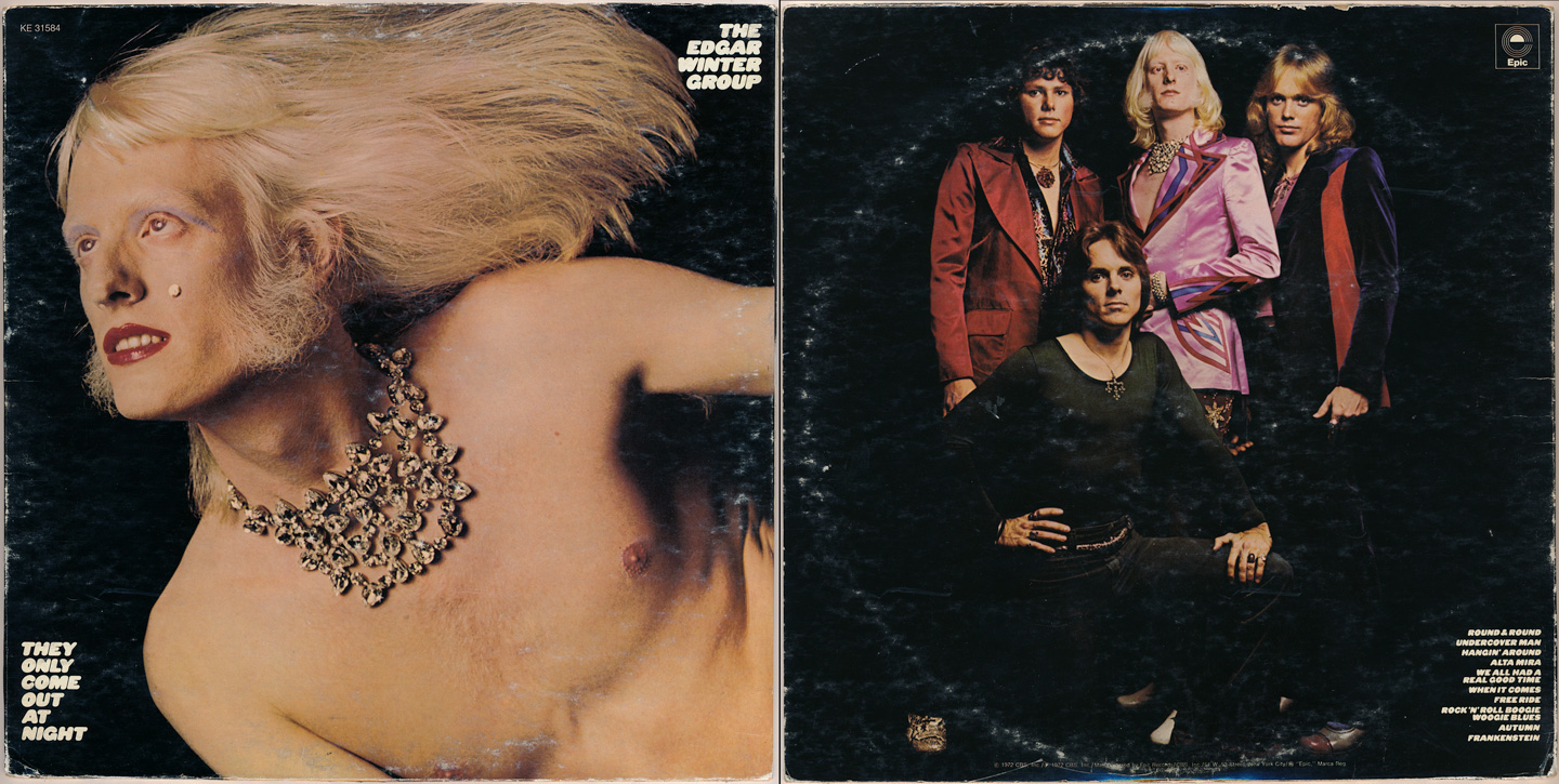
The Edgar Winter Group: They Only Come Out At Night (1972)
By 1972, the world was in full Glam/T-Rexstacy mode. Glitter/makeup, androgeny, foot-stompin' rhythm and outrageous design/fashion were all the rage. Edgar Winter's masterpiece (containing his biggest hits) lived up to the glam rock hype...but was also, at its core, a basic rock 'n roll record...and a good one.
From the bubbly type design to the iconic image of Edgar himself on the cover, this has to be heard & seen to really appreciate what audiences must have been thinking when they first got a glimpse. A true classic.
Choice tracks: When It Comes, Free Ride, Frankenstein

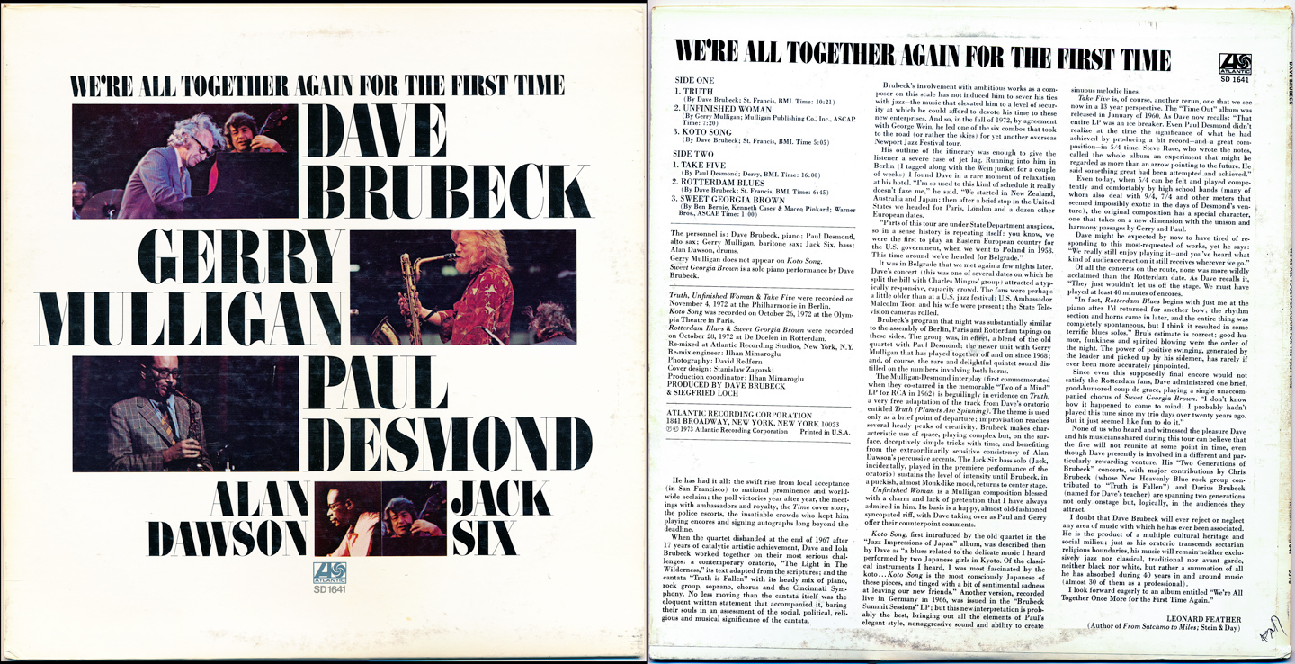
Dave Brubeck: We're All Together Again For The First Time (1973)
A return to the semi-traditional (and yet, still 'fresh looking' type) for Dave Brubeck's live 1973 release. I've always dug the cover design...perhaps because of its simplicity and careful placement of text and imagery. Additionally, the entire back cover 'image' (these were often glued-on) was completely misaligned. If you've never seen that (though with LPs it was somewhat common) it just makes you kinda go...hmmm. Analog days.
Choice tracks: Truth, Unfinished Woman, Koto Song

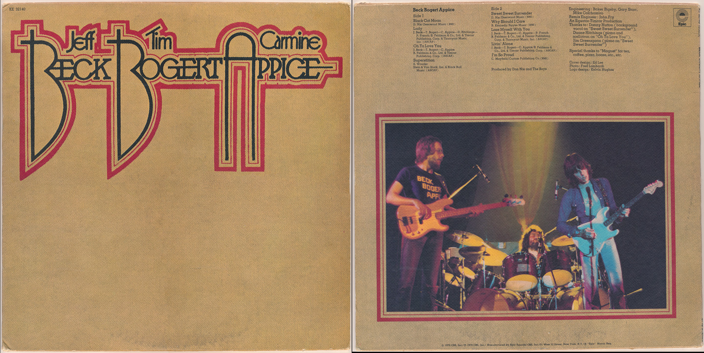
Beck, Bogert & Appice: self-titled debut (1973)
Not just another 1970s supergroup, the tight rhythm section of Bogert/Appice (both formerly of Vanilla Fudge & Cactus) and the incendiary guitar playing of Jeff Beck (late of The Yardbirds and his own Jeff Beck Group) created a seemingly unstoppable, dynamic musical force. Their cover logo, imprinted on textured stock (the record jacket was customized upon initial releases) became something of a statement for the group. On stage, they *were* unstoppable...but they weren't long for this world. This was their only 'official' release (a Japan-only live album was issued towards the end of 1973) but BBA remains a true phenom of the era.
Choice tracks: Black Cat Moan, Lady, Superstition
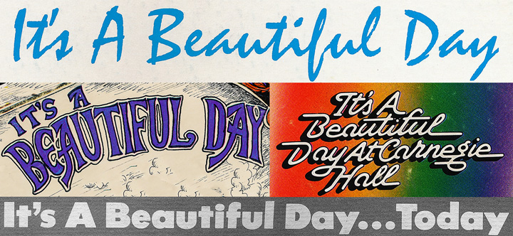
It's A Beautiful Day: Marrying Maiden (1970)
It's A Beautiful Day: Choice Quality Stuff/Anytime (1971)
It's A Beautiful Day: It's A Beautiful Day At Carnegie Hall (1972)
It's A Beautiful Day: It's A Beautiful Day...Today (1973)
It's A Beautiful Day: It's A Beautiful Day At Carnegie Hall (1972)
It's A Beautiful Day: It's A Beautiful Day...Today (1973)
One of my personal favorites, IABD began the 70s at the top of their game on the heels of a hit release and a super-tight band. They were a festival crowd-pleaser, thanks to the incredible electric violin & vocals of David LaFlamme and the lush, ethereal harmonies of beautiful singer Pattie Santos (one of my all-time favorites).
While their first LP is featured in my 60s collection, they delivered 4 more proper releases between 1970 and 1973, but never actually settled on a band logo/sonic identity. This, along with several line-up changes, including the departure of LaFlamme on their final studio album, contributed to their eventual dissolution. But their legacy, both in print and on vinyl, is a great one.
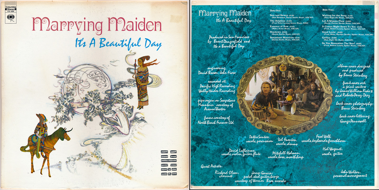
It's A Beautiful Day: Marrying Maiden (1970)
Choice tracks: Don & Dewey, The Dolphins, Soapstone Mountain
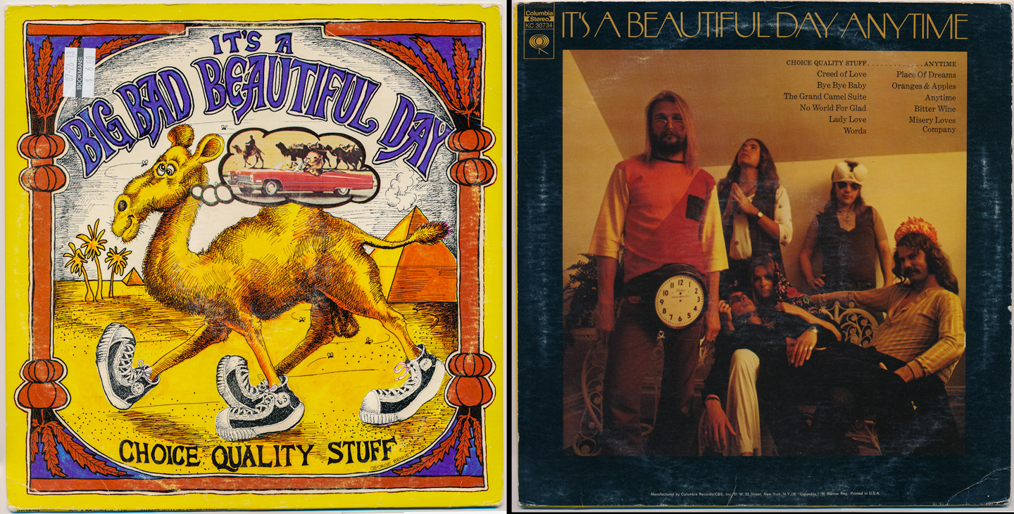
It's A Beautiful Day: Choice Quality Stuff/Anytime (1971)
Choice tracks: No World For Glad, Words, Bitter Wine
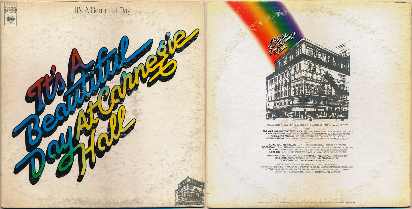
It's A Beautiful Day: It's A Beautiful Day At Carnegie Hall (1972)
Choice tracks: Give Your Woman What She Wants, Angels And Animals, Good Lovin'
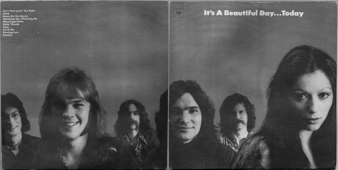
It's A Beautiful Day: It's A Beautiful Day...Today (1973)
Choice tracks: Ain't That Lovin' You Baby, Down On The Bayou, Burning Low

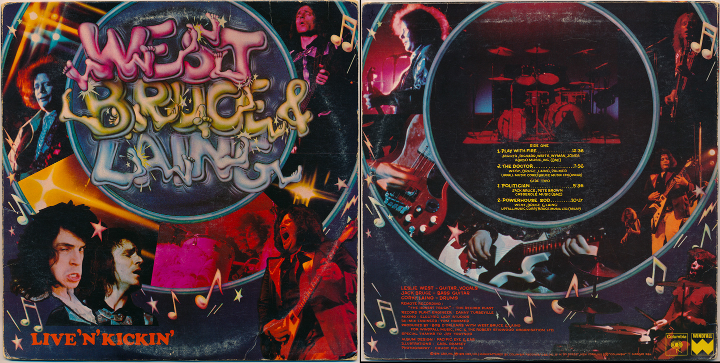
West, Bruce & Laing: Live 'N' Kickin' (1974)
In terms of cover design, this definitely falls into the category of 1970s rock excess. As for the typography, there is definitely something appealing about the hand-drawn logo and it's subsequent bizarreness. As a collage, it's just too much...and somehow it's still missing something. Sadly, the album itself doesn't fare much better musically; but for this classic power trio who only released 3 albums during their brief tenure (this being their final), it's an audio/visual timecapsule, capable of transporting you back to a time in rock music when excess was in, modesty was out, and you were only as famous as your longest guitar solo.
Choice tracks: Play With Fire, Powerhouse Sod

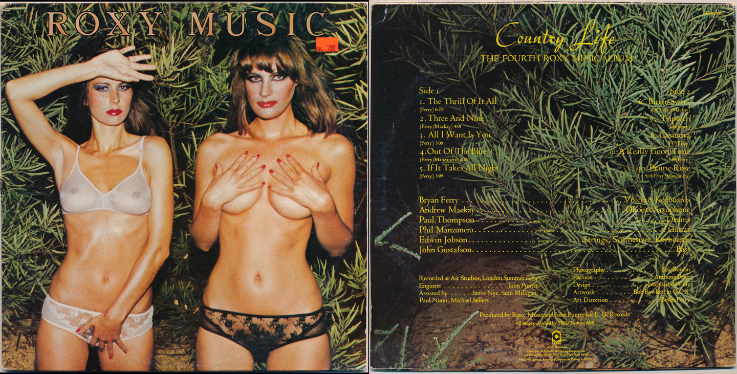
Roxy Music: Country Life (1974)
Roxy Music and their front-man Bryan Ferry exemplified British Art Rock. From their earliest days with Brian Eno, there was an artistic thread that ran thru every facet of their being: from their fashion choices replete with feather boas, daring makeup, and a general sense of non-mainstream, to the music itself, the cover artwork, the typography...everything about them simply overflowed with an artistic sensibility.
By 1974, the band was continuing to ride a wave of popularity; and though they weren't exactly 'Glam' per se (and Glam was on its way out at this point) there was always that essence of style, going against the grain.
What can be said about this cover? The typography choices are seemingly tame and simple...but perhaps perfectly chosen when juxtaposed against the semi-clad females on the cover (which naturally caused a certain degree of controversy in those days).
Choice tracks: The Thrill Of It All, All I Want Is You, Out Of The Blue
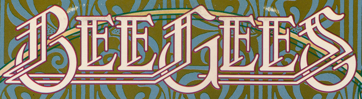
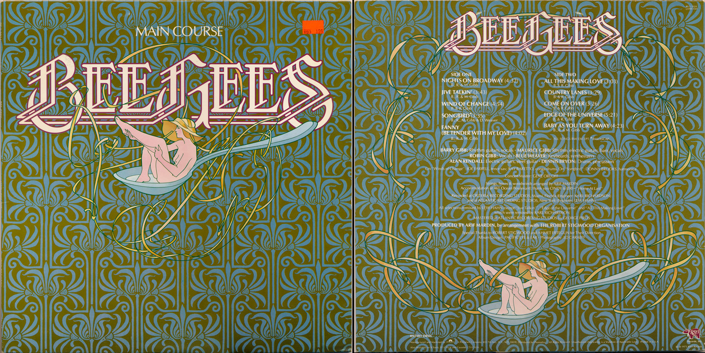
Bee Gees: Main Course (1975)
So much has been written about the Bee Gees that it feels unnecessary to ramble on...but for those unfamiliar with the period after their 60s flower-pop and before Saturday Night Fever, this album was a significant move forward for the Brothers Gibb in a number of ways:
It was their first to feature the new 'disco' sound, as evidenced most-successfully by the hit single, Jive Talkin'. Second, it was the first time their new logo was bestowed upon the public..and not unlike the famous Beatles logo, it became instantly recognizable. And third, it was the album (and driving vehicle) behind Barry Gibb's now-standard falsetto singing, his trademark. It all began here, and the rest is history.
Choice tracks: Nights On Broadway, Jive Talkin', All This Making Love

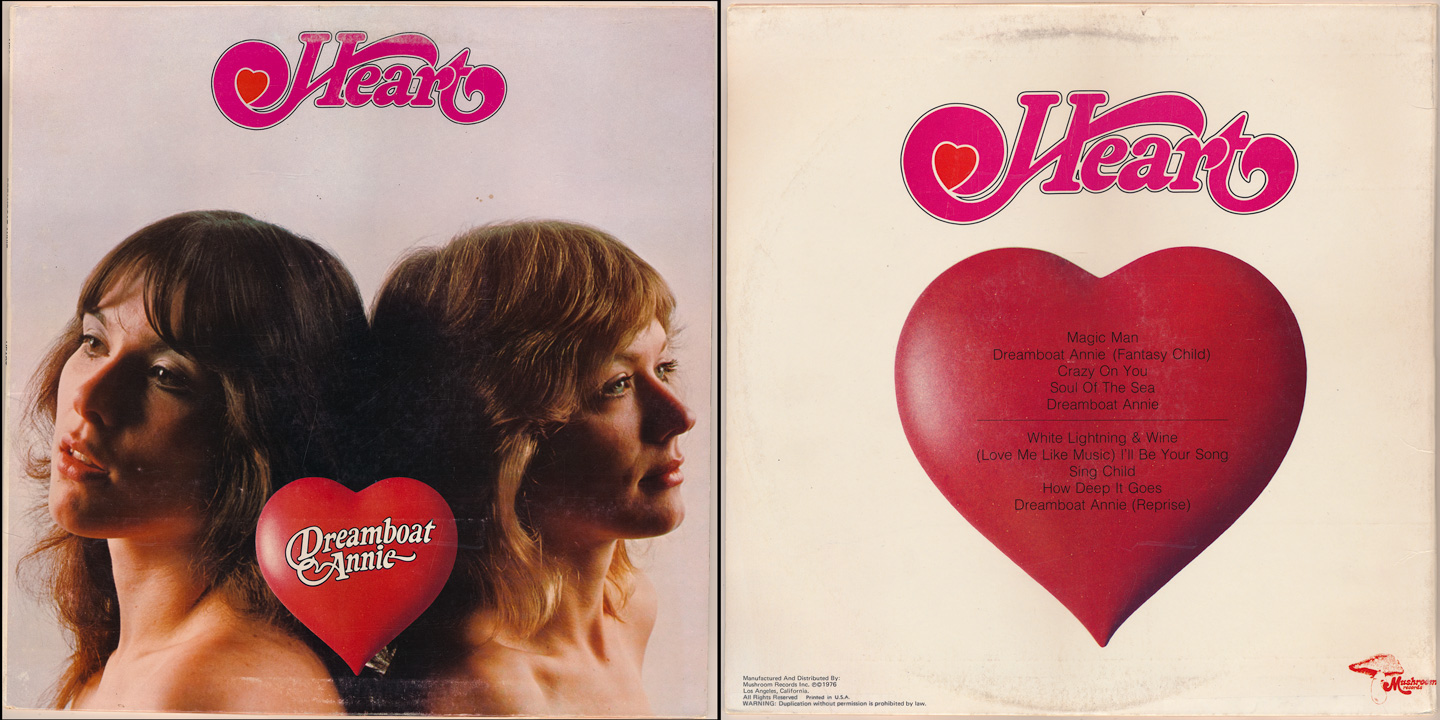
Heart: Dreamboat Annie (1976)
Two beautiful and talented sisters, a fledgling record label, and a hot backup band ready to take on the world by storm. This was Heart, circa 1976. Many will know their later 80s output (and their subsequent VERY 80s logo re-branding)...but this was how they started out - simple, clean, unassuming.
The cover design is so basic, but again, it speaks to the nature of the situation they were in...and then once the album became a hit? Well, that's where the real drama began. But for a debut album, everything about it (the logo, the cover image, the music inside) was just 70s perfection...and it still gives me shivers, listening to it today. When Ann 'coos' during Magic Man...that's all I need.
Choice tracks: Magic Man, Crazy On You, White Lightning & Wine
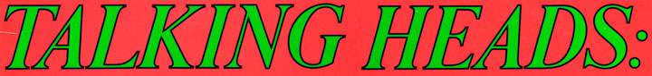
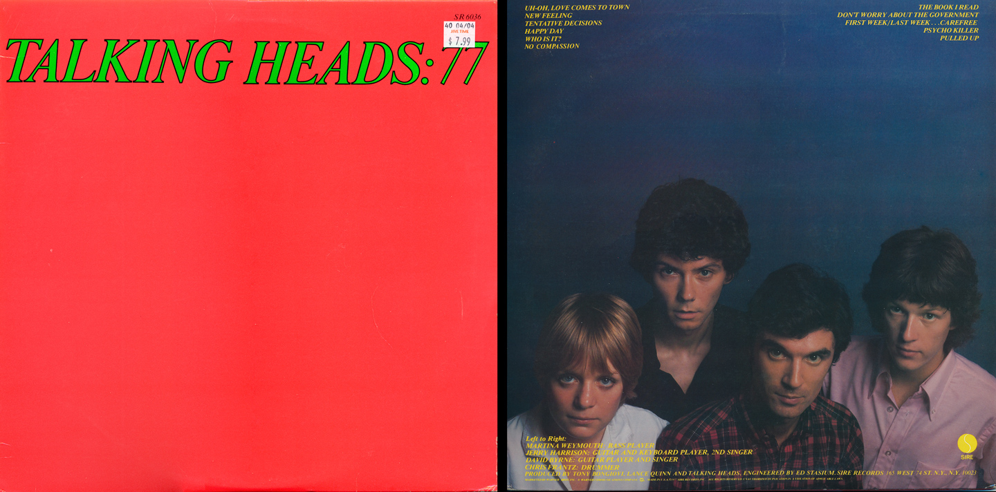
Talking Heads: '77 (1977)
On their debut, David Byrne and Co. had many a rock critic/reviewer scratching their heads. What *was* this music? Kinda punk, kinda pop, kinda...psycho. And that album cover? Well, it was produced the same year as the Sex Pistols' debut (also replete with dayglo/flourescent colors)... I think a common response upon first listen was, "What the f*** is this?"
Far from a hit at the time of its release, it is truly an amazing listen today as so much of what 'the heads' were doing would be copied and repurposed via countless other artists, but never duplicated. Their next several discs would be produced by none other than Brian Eno, and that's ultimately what made them the household name they came to be. But this (and that very red/dayglo green cover) is where it all began...
Choice tracks: Tentative Decisions, The Book I Read, Psycho Killer

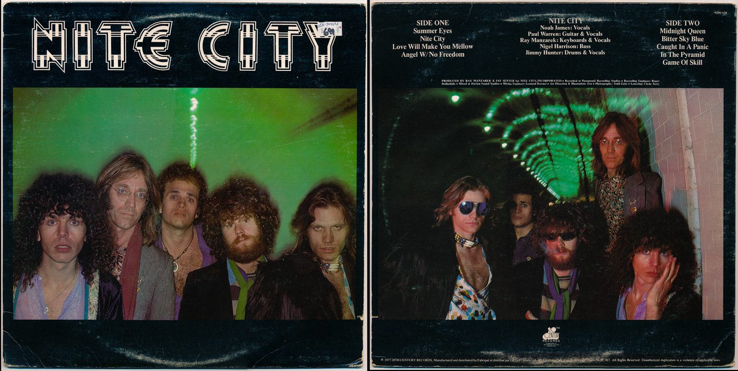
Nite City: self-titled debut (1977)
This is likely to be the most obscure and least familiar album in this collection. In short, Nite City was a band formed by Doors' keyboardist Ray Manzarek. As band leader and co-writer, it featured a slightly unique sound, almost like an updated, late-70s Doors on some tracks, but the vocal and guitar duties were definitely more rooted in 70s rock and not the classic Doors psychedelic mystery...but hints are present.
They toured quite a bit around the US in '77/'78 and would record one more album (changing a few members) before disbanding. Oddly enough, their bass player (the dude with the curly hair and bugged-out eyes, front left of the cover) went on to join Blondie after this album's poor performance. But the album itself (and their crafty logo, along with the very slick, LA-styled cover images) was enough to make me take a chance and listen...and some of it is really quite good. Granted, I'm a huge Ray Manzarek/Doors fan anyway, but had the promotion been right, they could have lasted a bit longer.
Choice tracks: Nite City, Love Will Make You Mellow, In The Pyramid

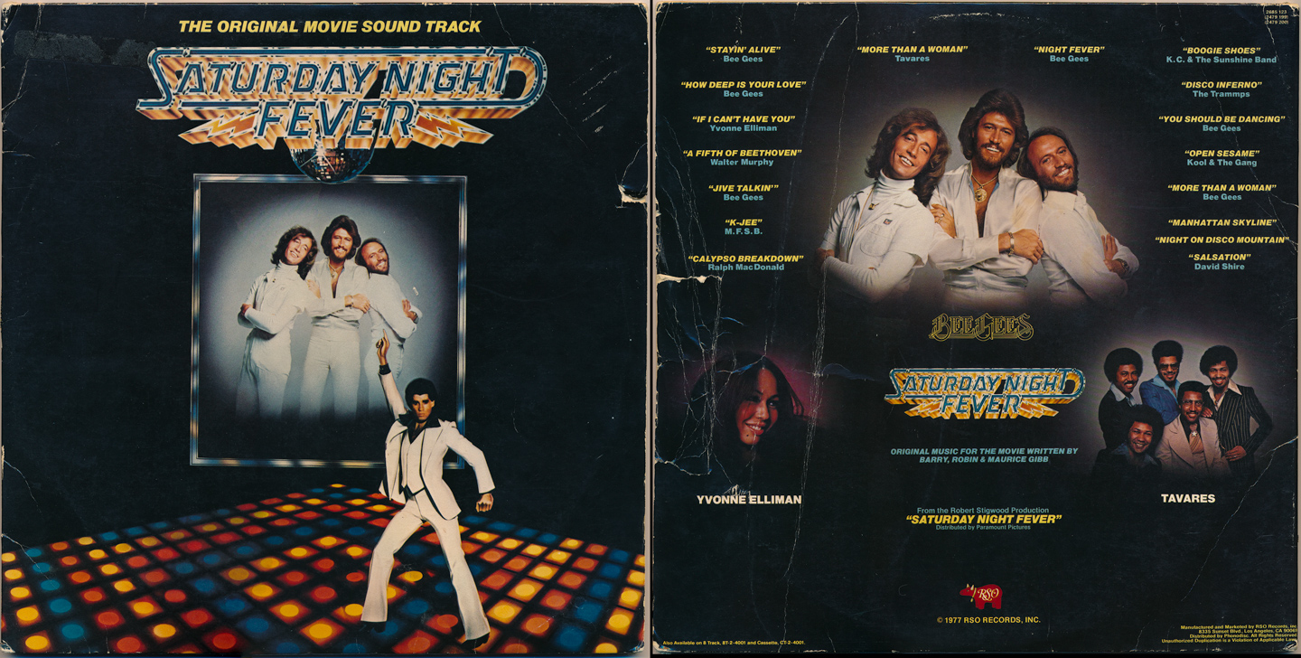
Saturday Night Fever: Original Motion Picture Soundtrack (1977)
The most classic, most-iconic, generation-defining record of the 70s (by many accounts)...this *was* disco, and from the very flashy logo, to the front cover design (with the classic image of John Travolta doing 'that' pose), to the back cover images with the resident disco masters, The Bee Gees (also writers of most of the soundtrack tunes)...this album had it all. A number one album around the world, it also held the distinction of being the best-selling soundtrack of all time for the better part of 15 years or so. It also happens to be the oldest album in my collection, in the sense that I've had it in my possession *since* 1977! I played it as a kid!
The design speaks for itself. You can see from the sleeve that this record has been played and played...but amazingly, the grooves are still in-tact, and it's also one of the best recordings of the era (particularly, the Bee Gees-performed songs). It's just a classic, whether you love or hate disco...and for the years that followed, it became the standard upon which all (successful) soundtracks would be judged.
Choice tracks: Stayin' Alive, If I Can't Have You, Night Fever, You Should Be Dancing
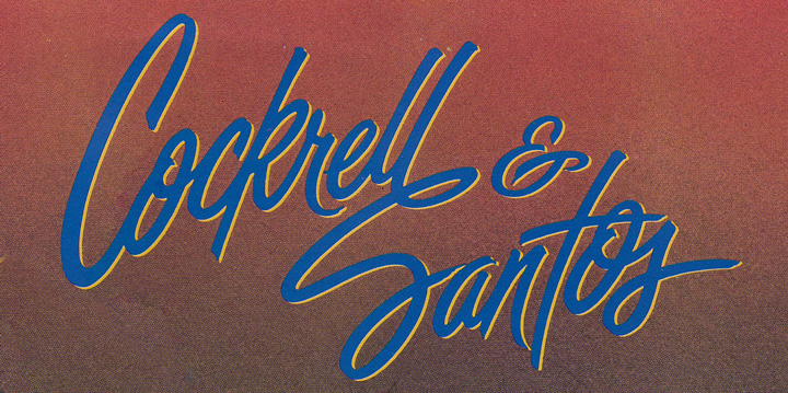
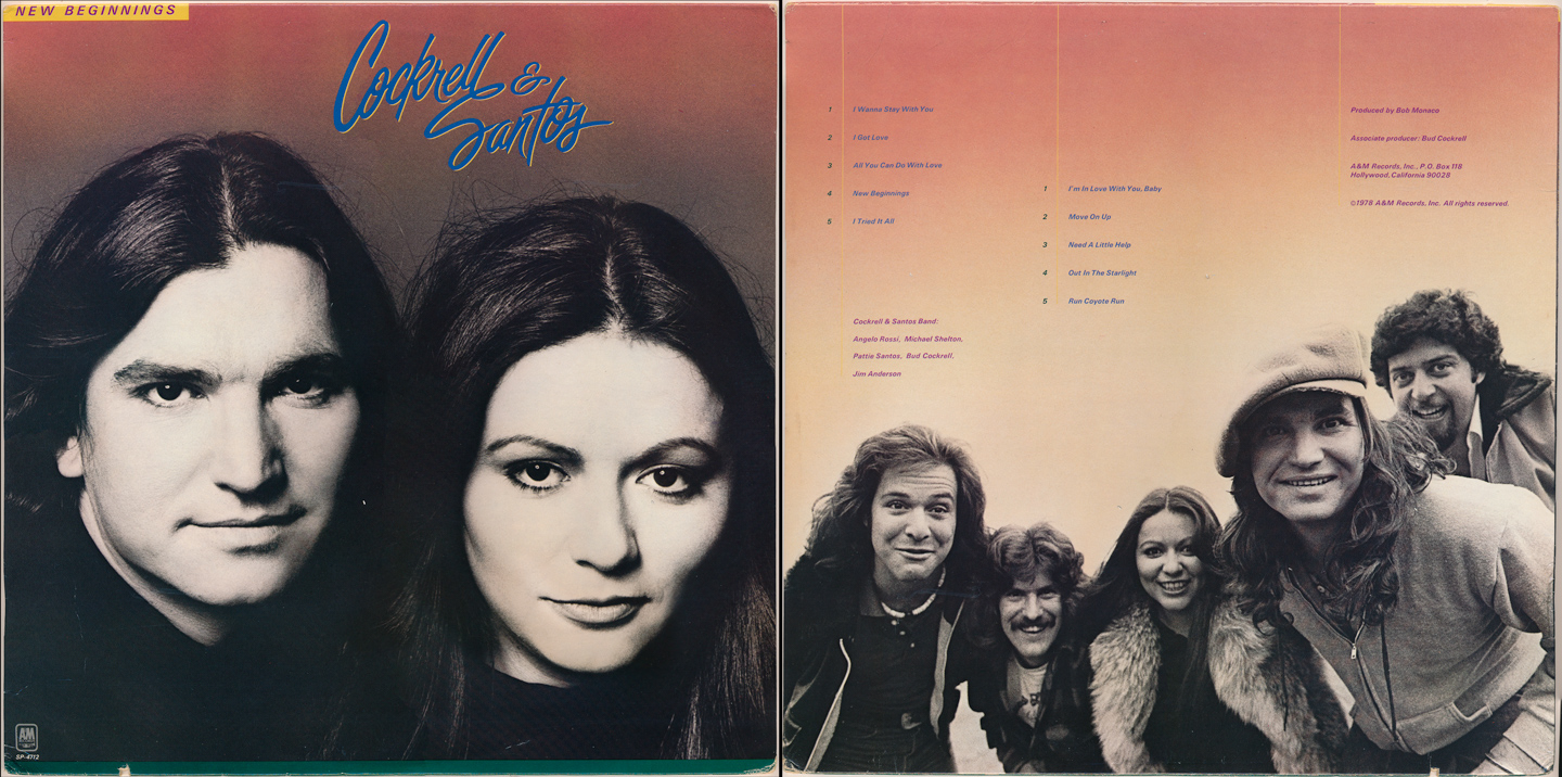
Cockrell & Santos: New Beginnings (1978)
Another obscure rarity, this album features some of my least-favorite typography of all...but the music that lies within is quite good. While many will not recognize (Bud) Cockrell or (Pattie) Santos, if you look above, you'll see that both were formerly in 'It's A Beautiful Day' (see the 'Today' cover from '73). Bud would leave IABD to join soft-rock band Pablo Cruise, leaving them just before they really hit big to make this album with his partner in love and life, the amazing Pattie Santos.
I hadn't realized that this particular cursive-meets-heavily-drop-shadowed style of typography started appearing semi-frequently around this time; I always associated it with the 80s & 90s. But here it is...
As for the music inside, it's definitely a collection of soft-rock/adult contemporary numbers, but the performances are great...and like SNF above, it happens to be among the best sounding pieces of vinyl in my collection (right up there with Steely Dan's AJA...yes...it's true).
This would be their only collaboration, though the two would remain together until Pattie's untimely death in 1989 from a car accident. She was a beautiful soul with a truly angelic-like voice, capable of ethereal, soft tones and belting, throaty agression. She was a real vocal treasure, right up there with Janis, Tina & Aretha.
Choice tracks: All You Can Do With Love, I'm In Love With You Baby, Run Coyote Run

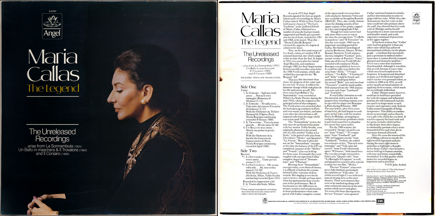
Maria Callas: The Legend | The Unreleased Recordings (1978)
Acoustic blues, rock, classical, jazz, disco and now...opera.
This album's design has always captivated me. I'm not sure why...but there's something very alluring about the type and the color choices. And that image of Maria? You could only really appreciate this on vinyl (ie, on cassette or CD it would just be too small). There's great contrast and shadow detail in the original, and I've just always loved the placement/alignment of the type; it just works.
Musically, these were likely unreleased for a reason, but they're still great. And, despite being 'electronically reprocessed for stereo' on several tracks, the recordings (spanning 15 years) are solid. This posthumous release was the look & sound of an opera legend...at the height of punk and disco. Pretty sweet.
Choice tracks: Verdi's Il Corsaro, Bellini's La Sonnambula - Compagne, teneri amici...come per me sereno
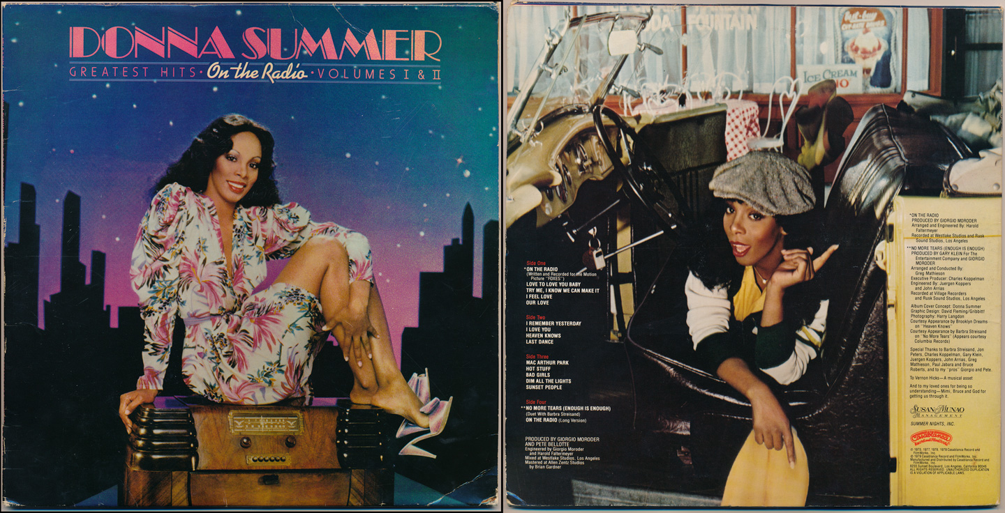
Donna Summer: On The Radio (1979)
If the Bee Gees were the undisputed kings of disco, there's no disputing the queen, Donna Summer. This collection, with the various type choices on the front cover, silhouetted city backdrop imagery, and Donna looking oh-so-lovely atop an old radio, feels like 1979 to me. From the hair and makeup to the color choices, to the retro-meets-new vibe...in some ways it feels like a 'passing of the torch' release, and I suppose it was.
With the dawning of the 80s, there was great change afoot in design, style, sound...everything. But for that one last gasp of the "me" decade, this one brings back the most memories. All the hits are here (up to this point, at least...Donna would continue a string of successful hits into the mid-80s) but that 'look'...it would never be repeated, not by anyone. This was also, by many accounts, the peak of her career.
A fine collection, and a fine closer to this collection of album cover artwork and typography.
Choice tracks: Love To Love You Baby, I Feel Love, Hot Stuff, Dim All The Lights
Be sure to check out Part 1: Album Cover Typography & Artwork | 1960s