A Study: Album Cover Typography & Artwork: 1960s
A look at the various graphic design elements from a collection of my favorite (and semi-esoteric) original LPs from the 1960s, focusing on typography and cover artwork.
I've been collecting records (LPs, 45s) for over 3 decades. Some I was given when I was a kid in the 70s, others I purchased down in the West Village on 9th Street in Manhattan back in the 80s & 90s, and many I acquired from my parents who bought them when they were new.
Naturally, the music present on these discs is what caused me to seek out them out. But once they were in-hand, it was the artwork and typography, the sleek and careful design of the album covers (some very elaborate, gate-fold; others very simple and understated) that continued to fascinate me beyond the sounds emanating from within the grooves.
By 1969, it's really anything goes, from heavily psychedelic hand-drawn styles to the overtly traditional.
It was also my goal to showcase lesser-known artists that many people have never heard of, nor seen...not an easy task when you've got thousands to work with:)
So, take a trip...turn off your mind, relax and enjoy.
note: This project is being presented as a typographical/artistic reference: a study in truly wonderful, original and influential album cover artwork and typography of a magnificently creative & innovative time. Best if viewed in full-size.
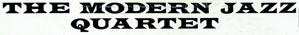
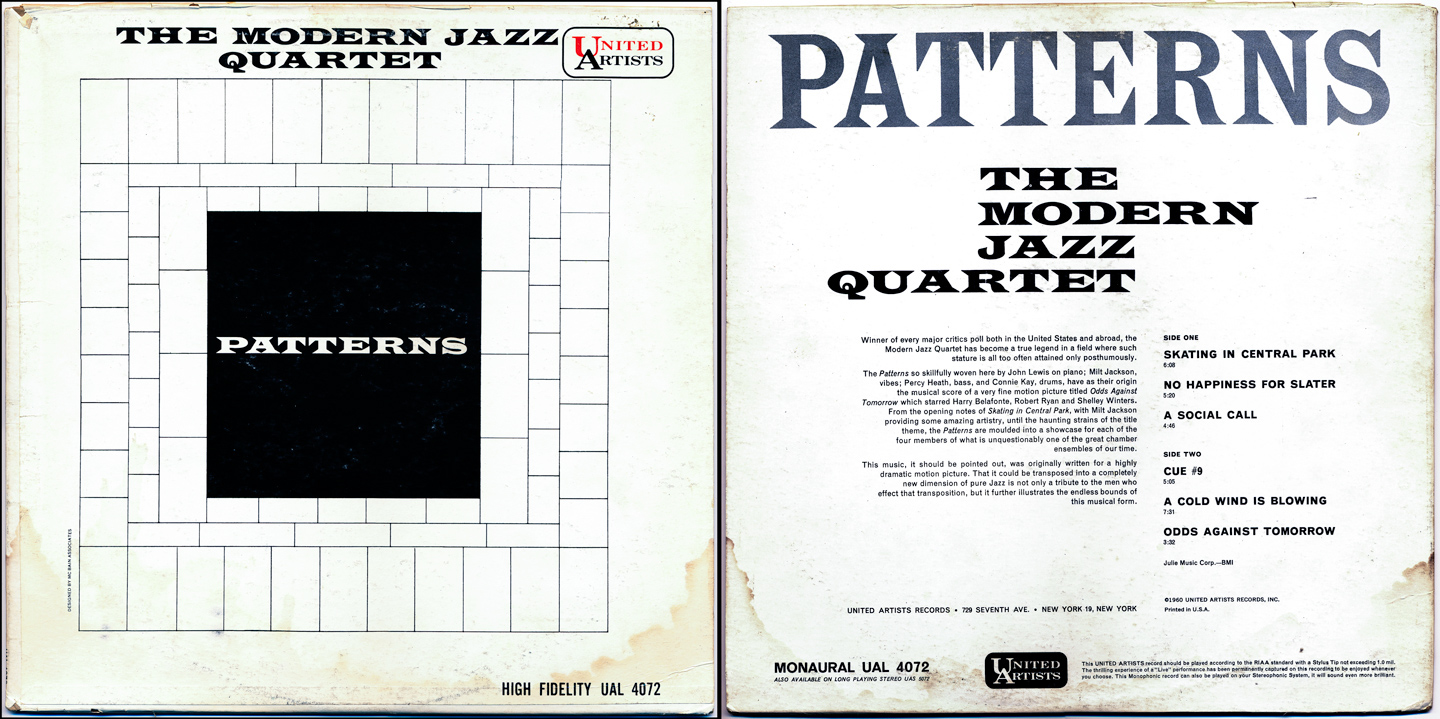
The Modern Jazz Quartet: Patterns (1960)
Simple. Clean. Black & White. It just feels kinda 'Mad Men', don't you think? Considering the variations and freedom in type styles that would be everywhere towards the end of the decade, it's fun to see the 1960s starting out this way...kind of a social comment on the current jazz music/pop culture scene at the time too...remember, we're still a few years away from Beatlemania, British Invasion and of course, psychedelia.
Choice tracks: Skating In Central Park, A Social Call, Odds Against Tomorrow
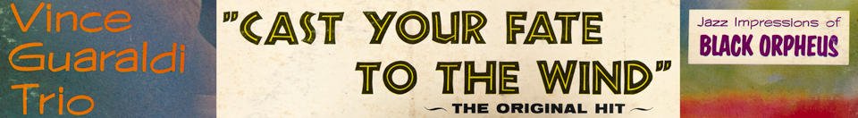
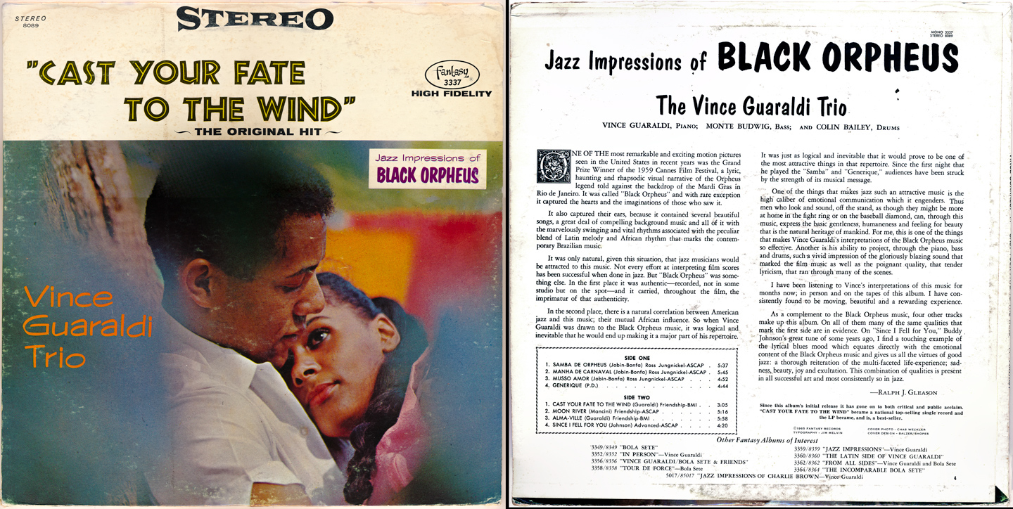
The Vince Guaraldi Trio: Jazz Impressions of Black Orpheus (1962)
A perfect example of 'don't judge a <record> by its cover'. Great music, questionable graphic design. This particular version is actually from 1965 after the title track had become a massive hit. The cover was subsequently re-designed to focus on the single, 'Cast Your Fate to The Wind'. Note the mixing of the various type styles; reminds me of my first website which had quite a few fonts on the home page; not so good. :P
Side note: If the name Vince Guaraldi doesn't sound familiar, he was the author/performer of the music from the classic Charlie Brown/Peanuts films of the 60s and 70s. Though he wouldn't record those until 1965, the essence and 'the sound' he'd become famous for is already here.
Choice tracks: Samba De Orpheus, Generique, Cast Your Fate to the Wind
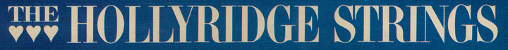
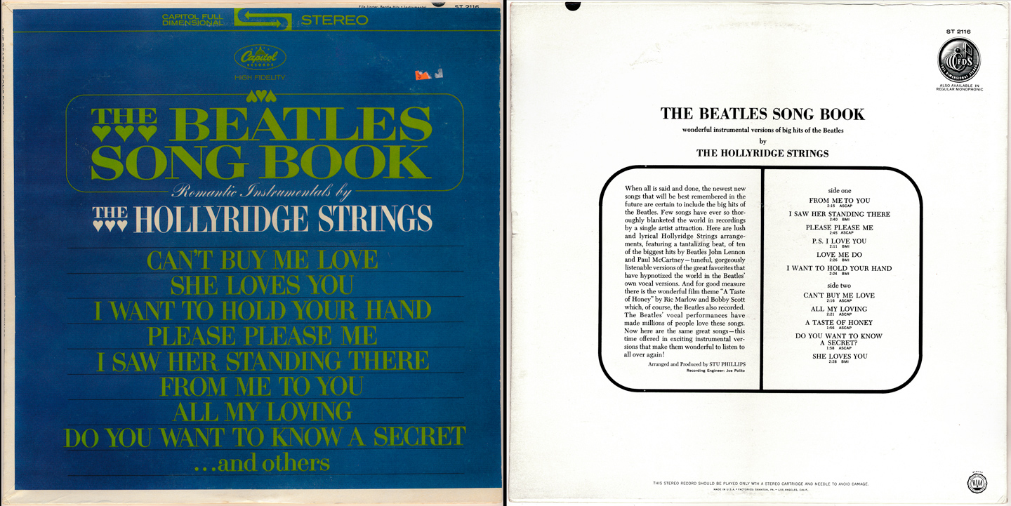
The Hollyridge Strings: The Beatles Song Book (1964)
Swanky yet understated in appearance, this album became a huge hit upon release and is partially responsible for popularizing 'easy listening' (or, elevator music, as we'd probably call it today) to the masses. To listen to it now, it grooves. Hard. And while the typography on the cover looks anything *but* cool, suave & sleek (note: the hearts appended to the front of the logo!), just listening to this makes you crave a cocktail.
Choice tracks: I Saw Her Standing There, Please Please Me, A Taste of Honey
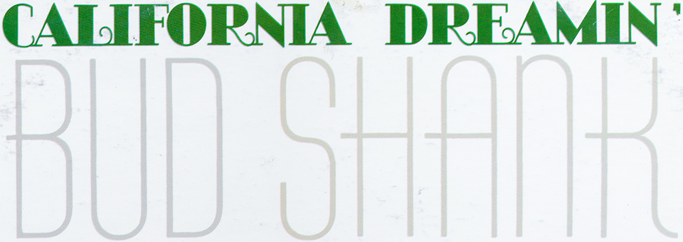
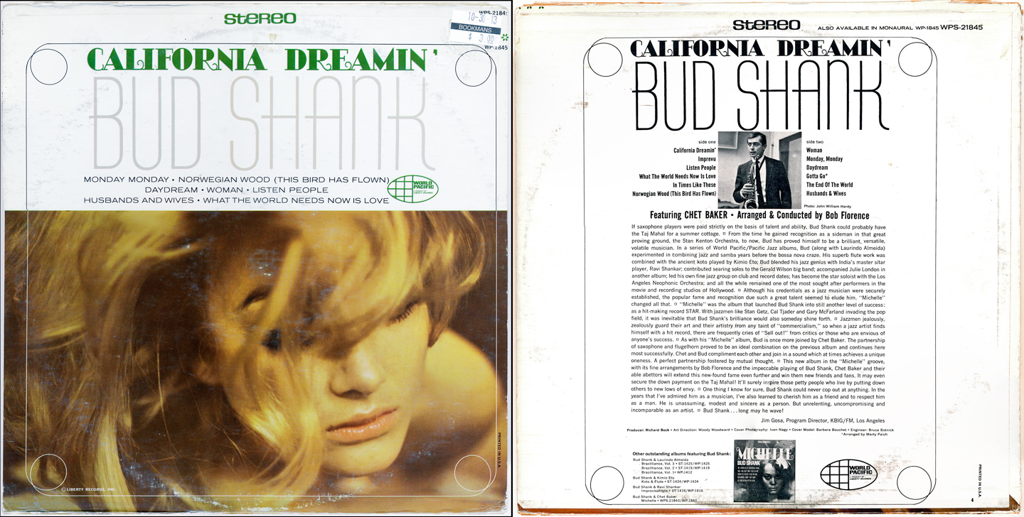
Bud Shank (w/Chet Baker): California Dreamin' (1966)
This album was cut during the early peak years of the Easy Listening boom. Bud & Chet cashed-in on a few LPs doing jazzed-up versions (what we'd consider 'elevator versions' today) of current pop hits (like the title track). Bud himself played the flute part on the original version (of California Dreamin') recorded by the Mamas & Papas a year earlier.
Choice tracks: California Dreamin', What The World Needs Now Is Love, Monday Monday
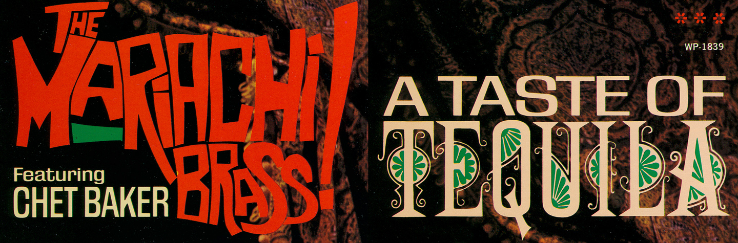
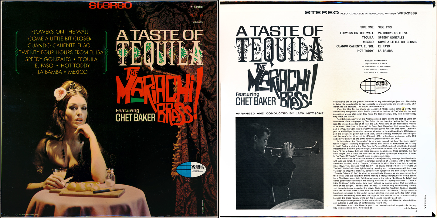
The Mariachi Brass! Featuring Chet Baker: A Taste of Tequila (1966)
As is often the case, you can never have too much of a good thing. Chet was persuaded to form a group of his own after the massive success of the his collaborations with Bud Shank. This was World Pacific Jazz's answer to A&M's Herb Alpert & The Tijuana Brass...but it meant coming up with a slick logo and a new band.
Funnily enough, many of the Mariachi Brass were the same session players in Herb's group.
I've always loved this logo style, for whatever reason...and the covers themselves are legendary.
Choice tracks: Flowers On The Wall, Tequila, Mexico
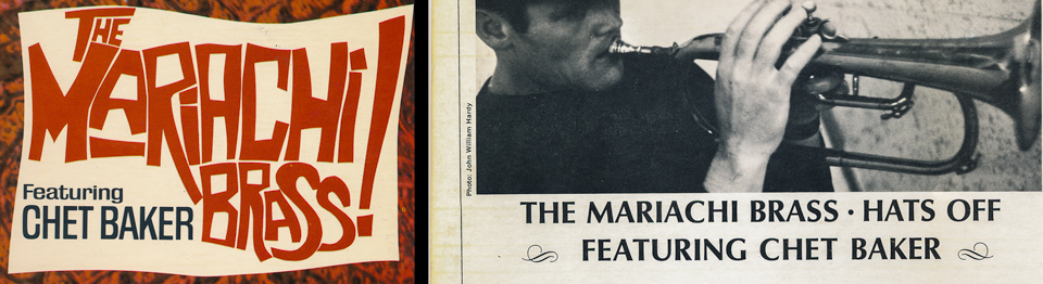
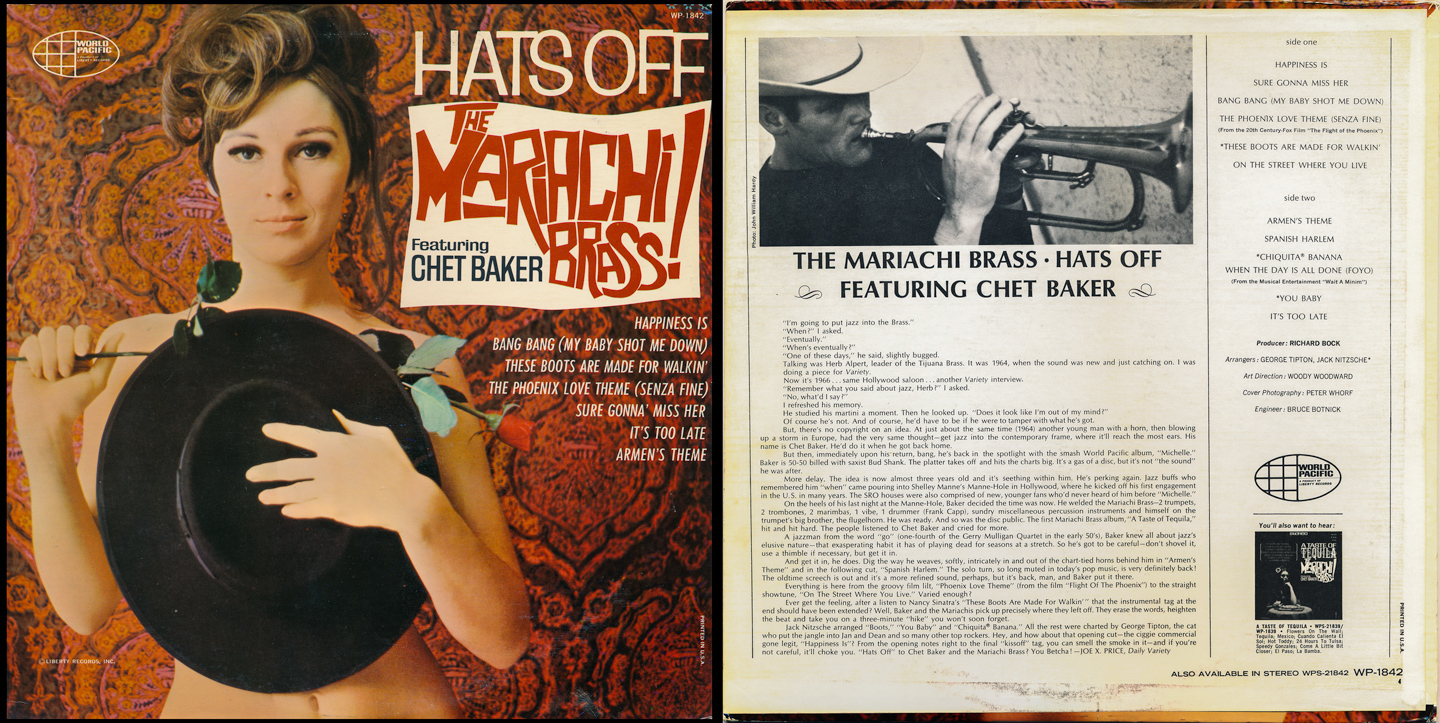
The Mariachi Brass! Featuring Chet Baker: Hats Off (1966)
This album is decidedly better (music-wise) than the previous one, but ultimately...the beautifully captured cover photography, along with the perfectly blended, swanky hand-lettered text reallly makes this art.
Choice tracks: Bang Bang (My Baby Shot Me Down), These Boots Are Made For Walkin', Armen's Theme
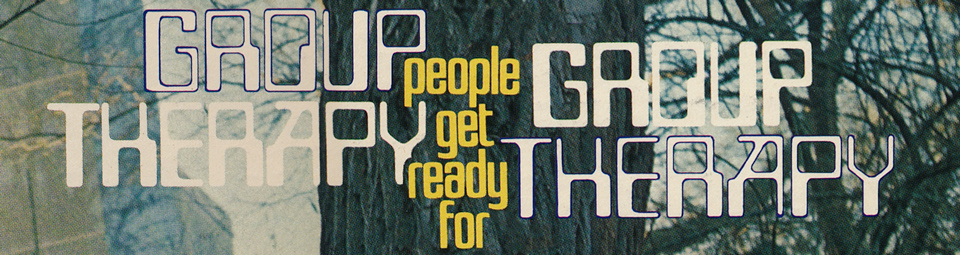
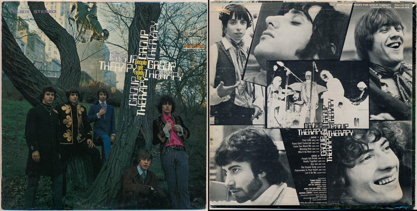
Group Therapy: People Get Ready For (1967)
Choice tracks: Foxey Lady, People Get Ready, Hey Joe
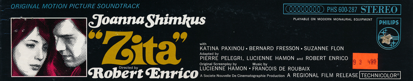
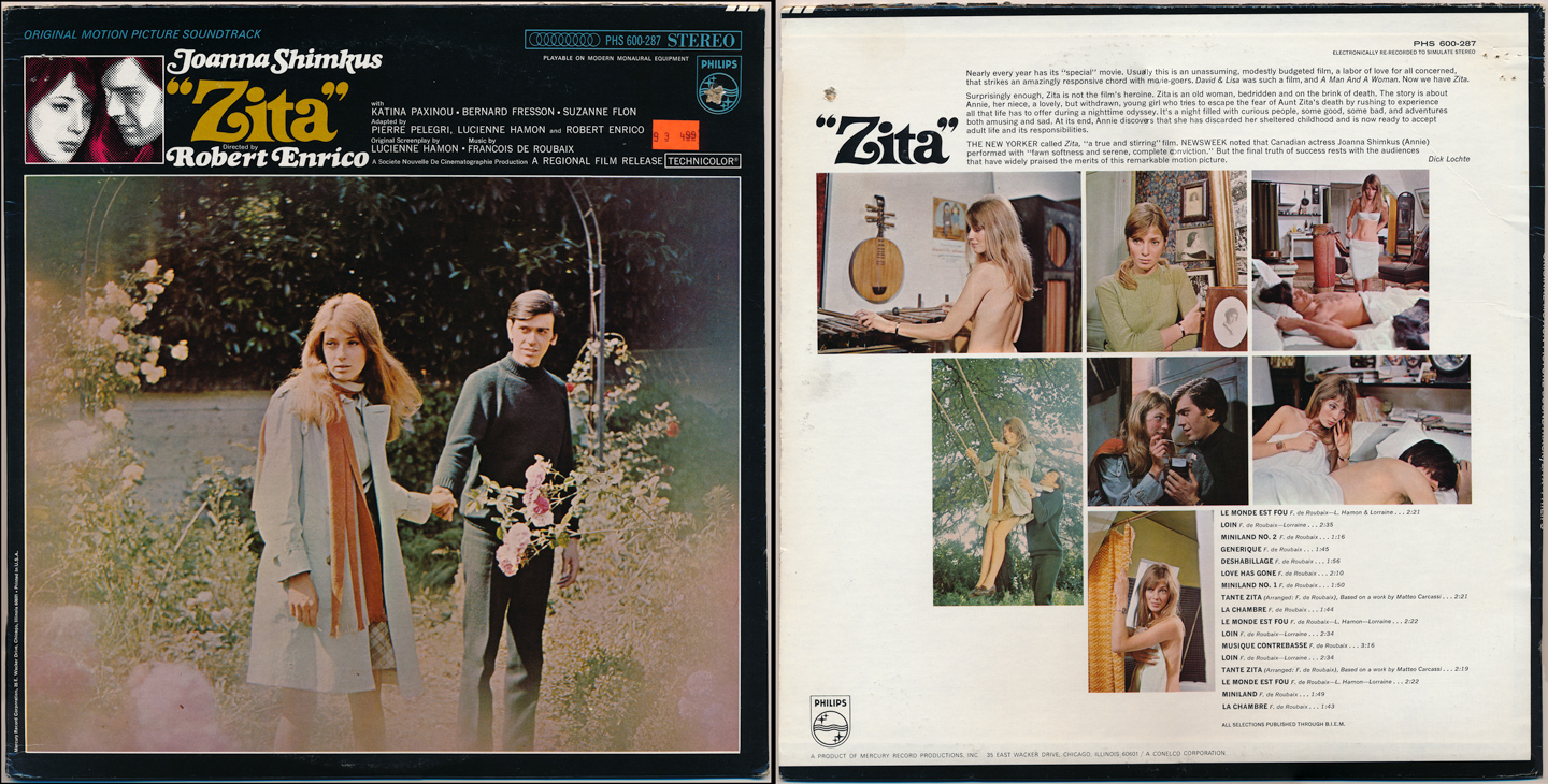
"Zita" - Original Motion Picture Soundtrack (1967)
As you can see from the purchase sticker, this was bought back in 1993 for $4.99. I had been somewhat familiar with the film (known as 'Tante Zita' throughout Europe) but was instantly intrigued by the cover design, the 'Zita' logo and the back cover layout. Once again, you can see/feel similarities in design style, especially given the year (1967). The music shares a similarly artsy/psychedelic/melancholy vibe.
Choice tracks: Le Monde Et Fou, Miniland No.1 & 2, Deshabillage
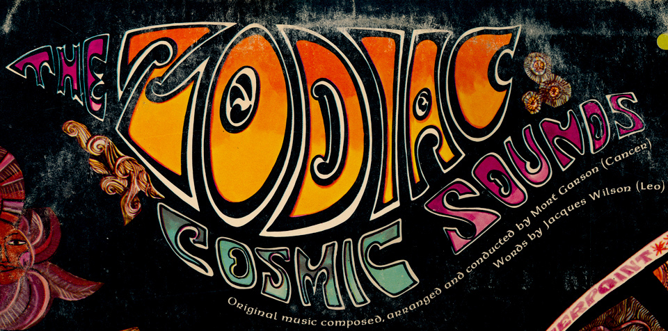
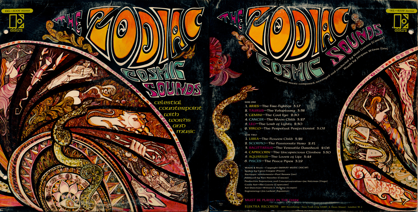
The Zodiac: Cosmic Sounds (1967)
This album is certainly one of the most obscure in my collection...but the typography always attracted me. If ever there were an album that truly defined the look, feel & freedom of the Summer of Love, it's this one.
I probably spent a few days examing and trying to re-create this cover (and it's super groovy, hand-lettered style) back in my early band days. The music itself is firmly rooted in 1967...with narration, no less.
Choice tracks: All of them. Pure psychedelia, this album also features some of the earliest use of the Moog synthesizer.
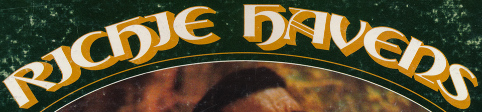
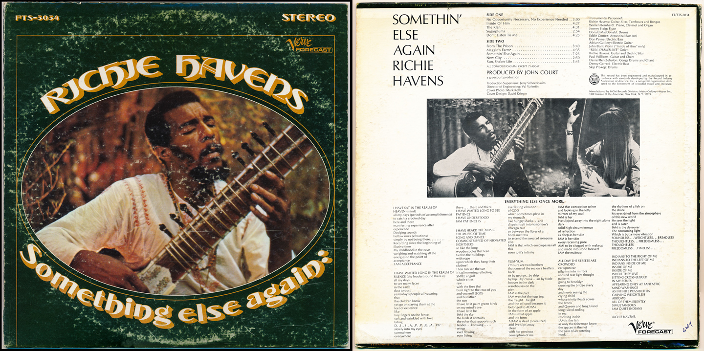
Richie Havens: Something Else Again (1968)
While it would be another 18 months or so until he received worldwide superstardom with his stunning and tour-de-force opening performance at Woodstock in August '69 (and the subsequent film in 1970), it was this album that first attracted me to him. The curved type, the cover image w/Richie in full sitar-playing mode, and the general feeling that this album would be a listening experience. Folk meets Indian meets Dylan. 1968.
Choice tracks: No Opportunity Necessary/No Experience Needed, Sugarplums, Maggie's Farm
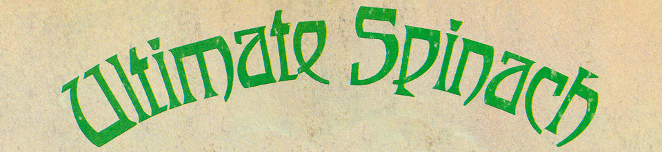
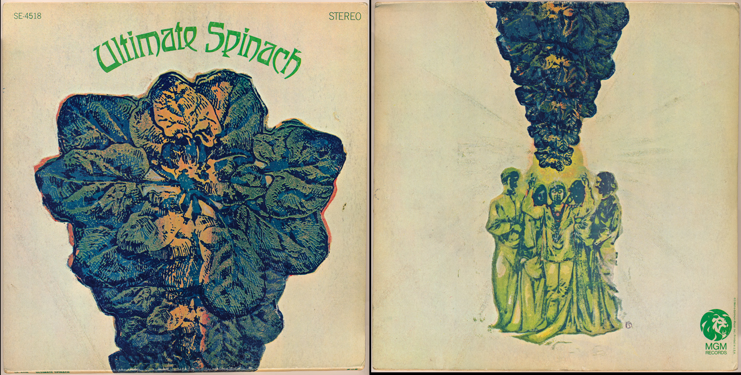
Ultimate Spinach: self-titled debut (1968)
Another obscure rarity, and one I acquired as a young kid from my Mom's collection. Ultimate Spinach were being touted as leaders of an east-coast psychedelic movement known as 'The Bosstown Sound' . While they never achieved great success, this first album is replete with psychedelic magic and wonder.
The cover design (and the group's name) were a perfect match. A gatefold cover, the album graphics were actually presented sideways, so as you can see in the picture below, the 'spine' of the jacket is on the bottom. Curved text and hand-lettered type continue a popular trend (see above).
Choice tracks: Sacrifice of the Moon, Ballad of the Hip Death Goddess, Your Head Is Reeling
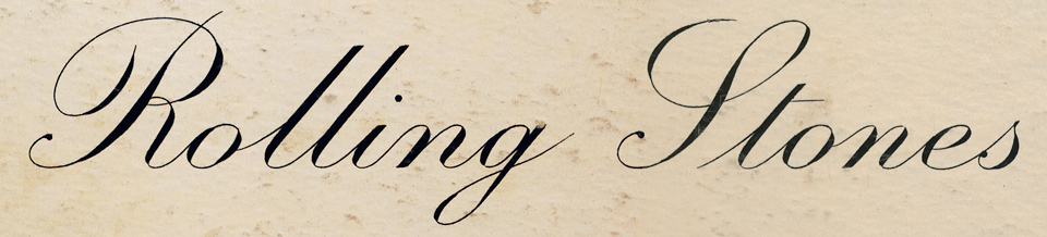
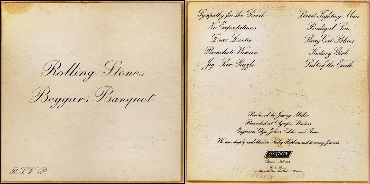
The Rolling Stones: Beggars Banquet (1968)
As the psychedelic scene began it's gradual downward spiral towards the end of 1968, it was rather fitting that the poster children for non-conformist rock, The Rolling Stones, suddenly went conventional with their cover typography...and kept it consistent throughout. While there's a history behind this cover and an alternate that was deemed too offensive for the time, it's a real statement, rejecting everything trendy at the moment, making their album look like an invitation to a bourgeois dinner party...but the music? Anything but.
Choice tracks: Sympathy for the Devil, Parachute Woman, Street Fighting Man
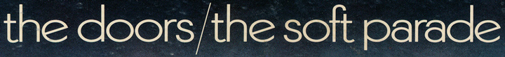
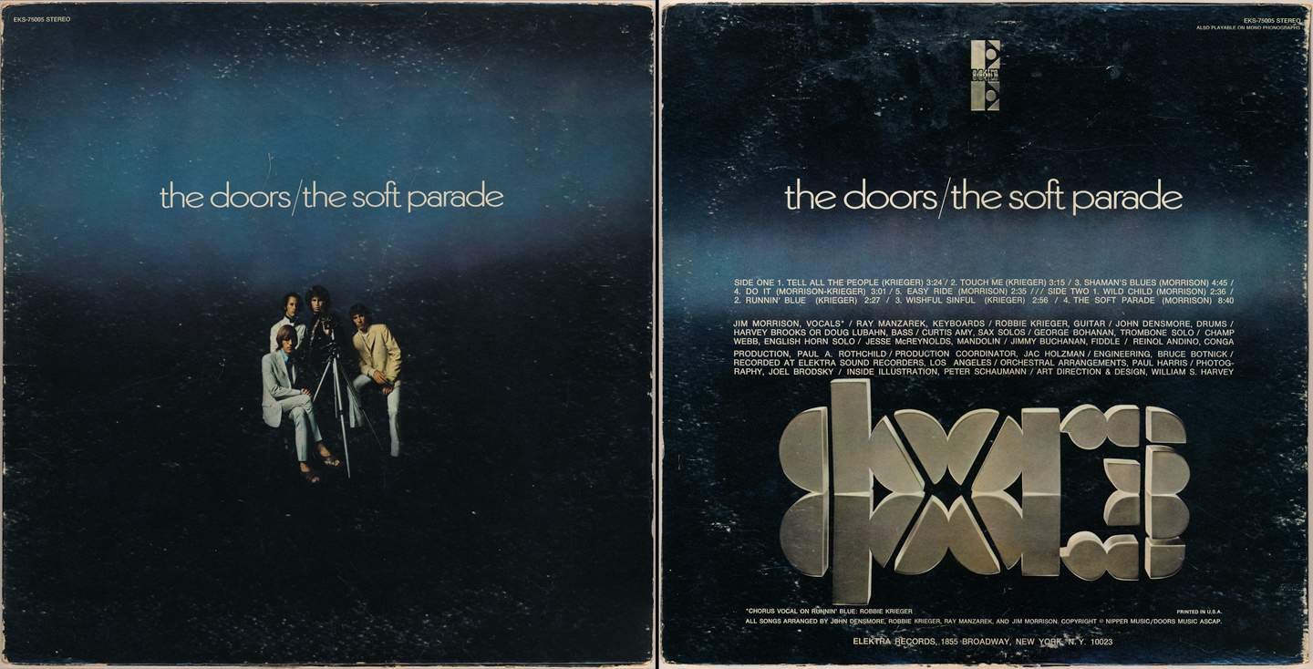
The Doors: The Soft Parade (1969)
Ok, two well-known groups back-to-back...I know. But I couldn't resist showcasing this album's cover art and typography as the first entry for 1969. It's simple, it's lowercase, the symmetry, colors and contrast, the reflective logo on the back, the carefully placed & centered Elektra logo atop the jacket...it has always appealed to me. There's light and darkness (which is very true of the album itself). Many fans at the time rejected it (because of its use of horns/strings) but was still a hit release with a very appealing and oft-copied type style.
Choice tracks: Tell All The People, Touch Me, Shaman's Blues, The Soft Parade
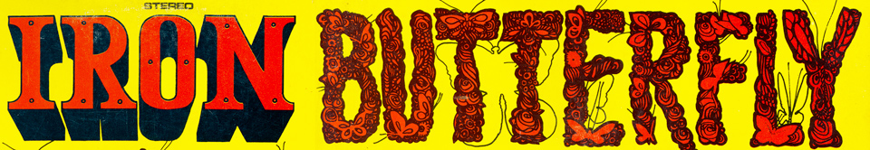
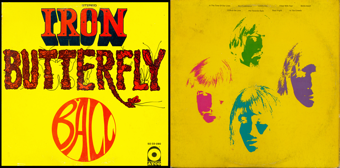
Iron Butterfly: Ball (1969)
While this may have been their highest-charting album, Iron Butterfly are of course world-reknown for their 17-minute opus, 'In-A-Gadda-Da-Vida' from 1968. This album cover, front and back, really speaks of the freedom and experimentation that was becoming more commonplace.
Choice tracks: In The Time Of Our Lives, Soul Sacrifice, In The Crowds, It Must Be Love, Her Favorite Style
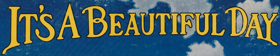
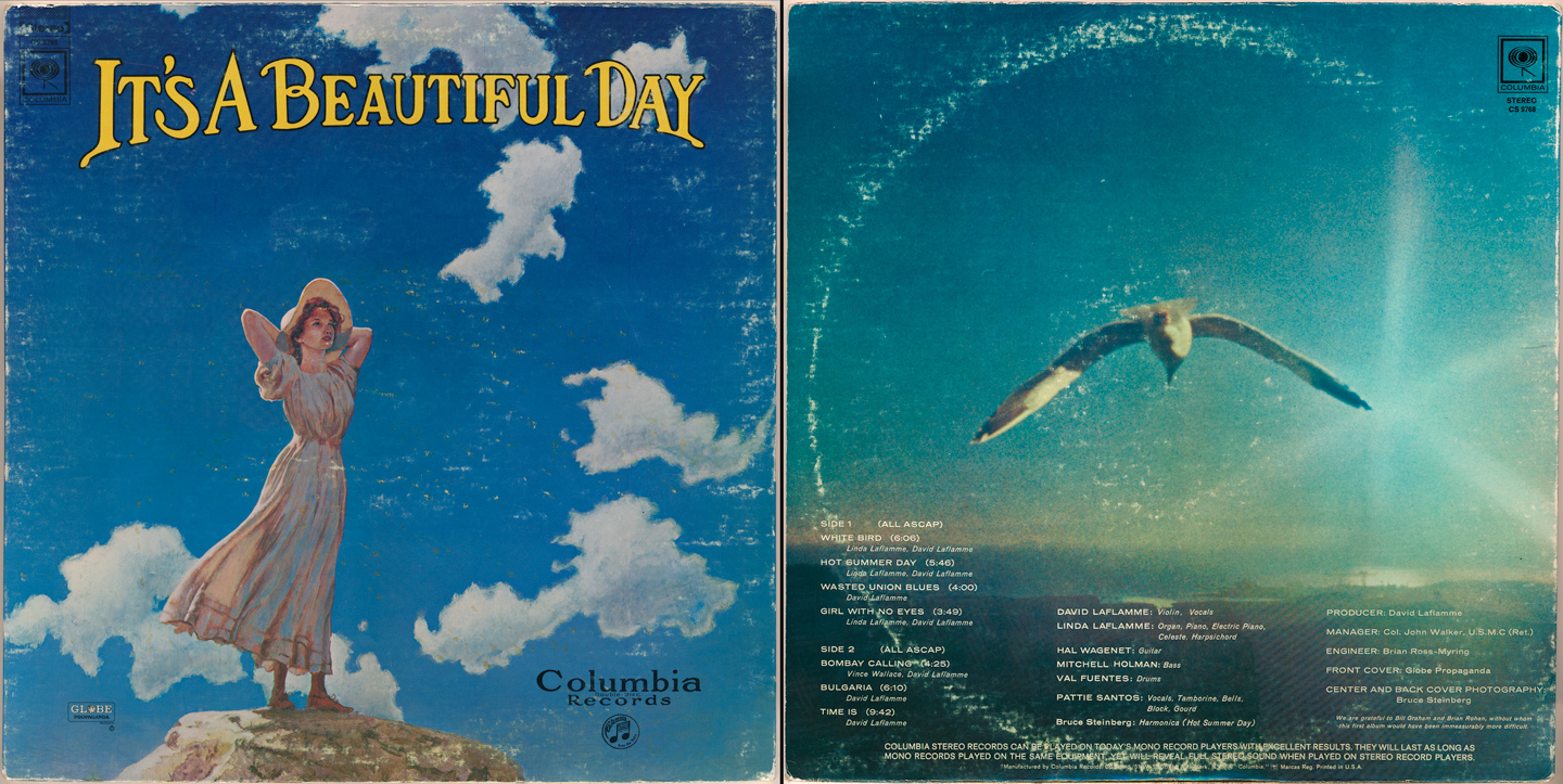
It's A Beautiful Day: self-titled debut (1969)
Perhaps one of the most psychedelic, original Bay Area bands to emerge from the scene in 1967, their debut album (and in particular, the logo and the iconic cover image, originally painted by George Hunter) completely personified the genre in every which way. In other words: anything goes! Note the old-school, turn-of-century curved text & original Columbia logo, added at the request of the label.
Choice tracks: White Bird, Hot Summer Day, Bulgaria
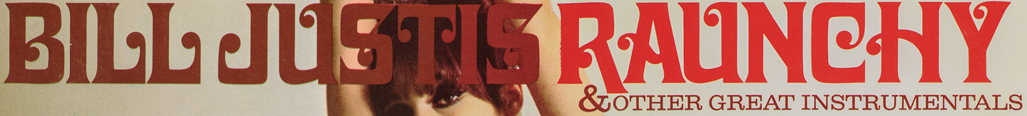
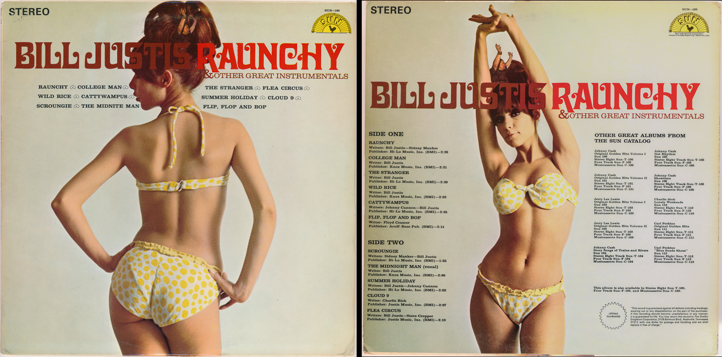
Bill Justis: Raunchy & Other Great Instrumentals (1969)
'Raunchy' is the song that George Harrison famously played for his audition into John & Paul's group, on the top floor of a double-decker bus, crusing through the Liverpool night. Bill Justis could write some slick, swanky, rock & roll grooves back in the late 50s...but the late 60s-styled cover design just makes this collection.
(note the image of Bill, jumping out of the 'Justis' text. This is a Sun Records masterpiece)
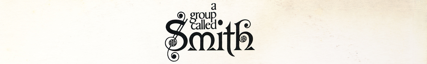
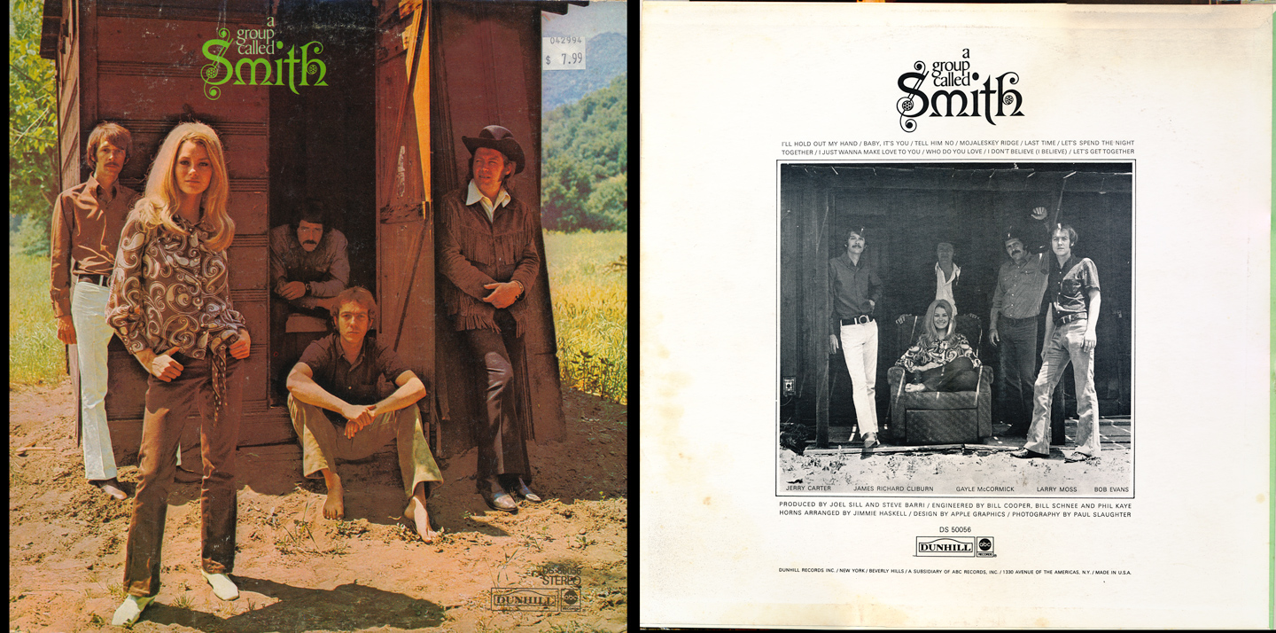
Smith: A Group Called Smith (1969)
If you are familiar with 'Smith', I tip my hat to you:) As a true one-hit-wonder band (despite their infectiously beautiful and talented singer, Gayle McCormick) their claim to fame was a re-make of an old Shirelles hit (and later, done by the Beatles' on their debut) "Baby, It's You". While I bought this back in the early 90s, Smith were reintroduced to fans via Quentin Tarantino in 'Grindhouse: Death Proof'.
Their logo, the color symmetry...something about this cover made me grab it out of the bins...
Choice tracks: Let's Get Together, Baby It's You, I Just Wanna Make Love To You
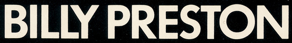
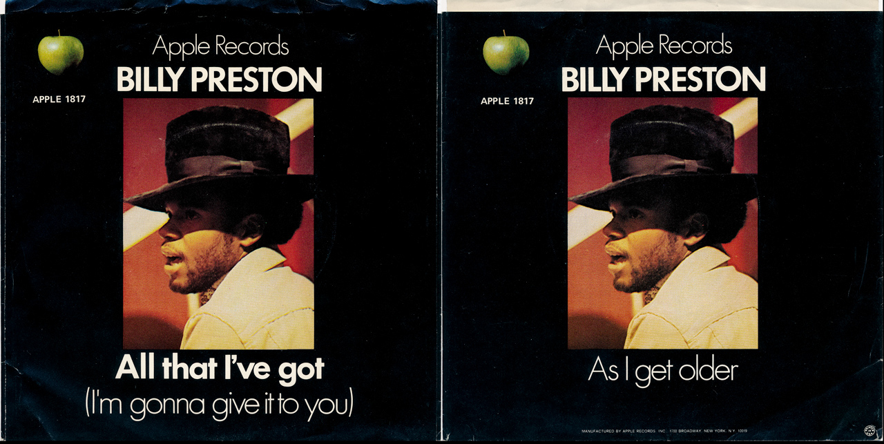
Billy Preston: All That I've Got b/w As I Get Older (Apple Records 45, 1969)
Billy was a legend; he's the only other artist ever to be credited on a Beatles single (Get Back & Don't Let Me Down) and he was a keyboard master and major influence on me as I started making music, all the way through today. It would be several years before he hit big, but these early sides showcase his mastery.
Choice tracks: All That I've Got (I'm Gonna Give It To You), As I Get Older
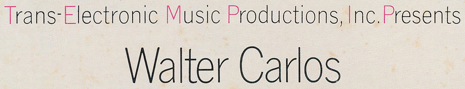
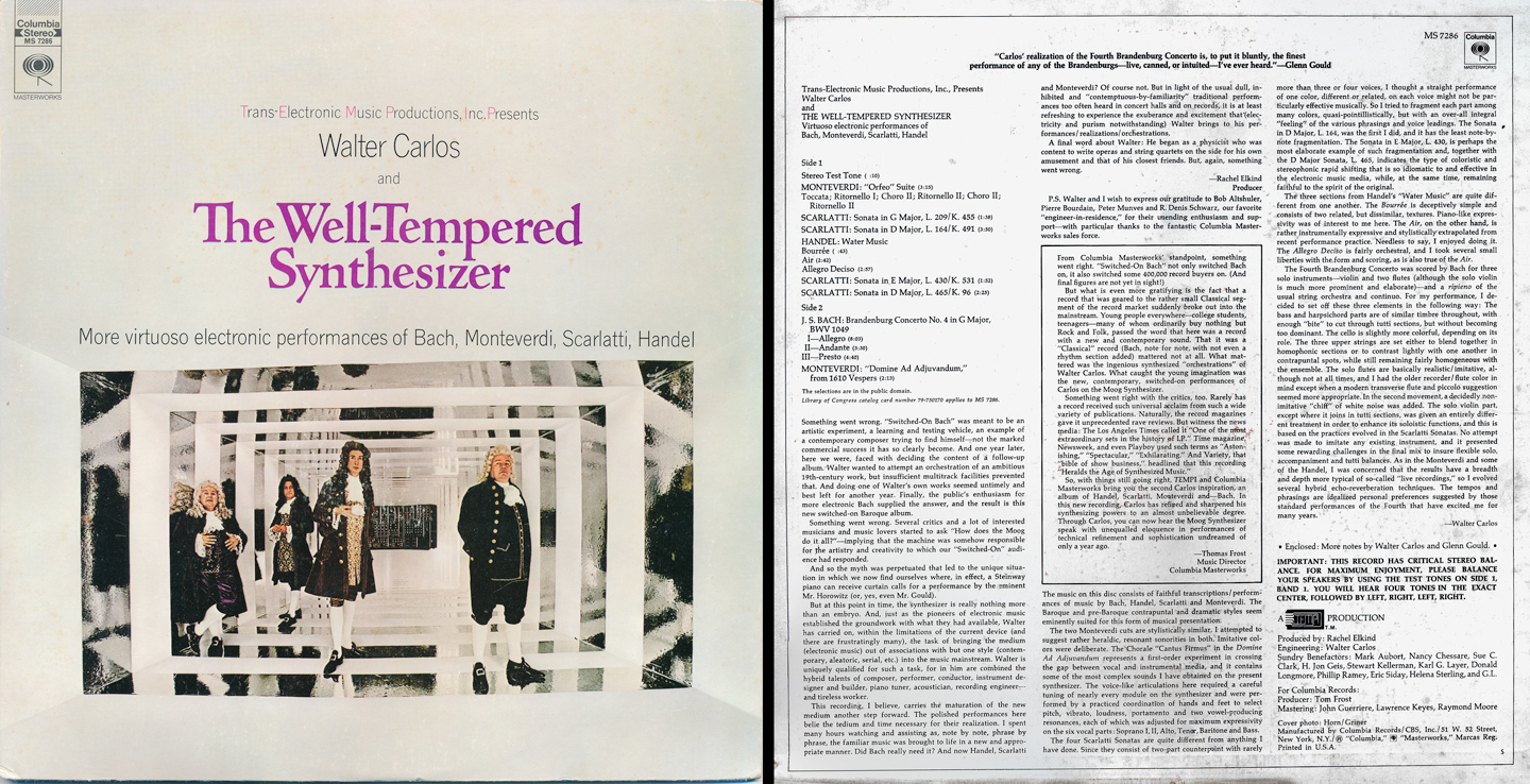
Walter Carlos: The Well-Tempered Synthesizer (1969)
I close this collection with an electronic classic (and hard to find rarity) by Moog Synthesizer pioneer and virtuoso, Walter Carlos. This was Carlos' second album of 'electronic' classical, following the phenomenal worldwide success of "Switched On Bach" the year before.
Walter Carlos is more famous, however, as 'Wendy' Carlos...and later pressings of this album reflected that. This is the original from 1969 with it's 'return' to understated type, albeit with slightly psychedelic imagery on the front cover (that's Wendy in the center, standing in front of the Moog Modular).
Choice tracks: Monteverdi-Orfeo Suite, Handel-Water Music Allegro Deciso, Bach-Brandenburg Concerto No.4
A full-circle return to simplicity (as reflected in many of the releases during 1969). As the 70s loomed, things would go back & forth between understated and over-the-top, including some of the hand-drawn styles that we've come to love & loathe today.
Be sure to check out Part 2: Album Cover Typography & Artwork | 1970s